An undertone is the direction a color leans. Every color, even one that looks neutral, carries a bias toward some neighboring hue. A gray that leans violet. A red that leans orange. A white that leans yellow. The undertone is invisible while the color sits alone, and obvious the moment it meets another color.
That last part is the whole difficulty. You cannot see an undertone by staring harder at the color. You can only see it by comparison.
Contents
- Three places you meet the word
- What an undertone actually is
- Masstone and undertone
- The drawdown, where the undertone shows
- Why undertone decides what a paint can mix
- Why paint labels say green shade and red shade
- Why your new gray wall looks purple
- How to find the undertone of a paint yourself
- How to see undertone in an image
Three places you meet the word
Most people meet the word “undertone” at a cosmetics counter, where someone holds a strip of foundation against their wrist and announces that their skin is warm or cool. Painters meet it on a tube label. Interior designers meet it on the afternoon a client’s new gray wall dries and reads distinctly purple.
Three different rooms, one phenomenon. The word came from paint, and the paint sense is the one that explains the other two, so that is where this goes. If you came here for skin tones, the mechanism below is the same, but the examples will be pigment.
What an undertone actually is
A color has a position and a direction. The hue name gives you the position. The undertone gives you the direction.
This sounds like hair splitting until you try to mix something. Two tubes both labeled red can sit side by side looking like the same red, then produce two completely different violets when you add the same blue to each. Nothing about the position explained that. The direction did. One red was traveling toward orange and the other toward violet, and the mixture obeyed the direction, not the label.
The reason the lean stays hidden is that your eye judges color by comparison, not in absolute terms. A tower photographed against an empty sky looks upright. Stand a vertical edge next to it and the lean is undeniable. Color works the same way. A gray chip alone on white looks gray. Put it against a truly neutral gray and the violet in it appears instantly, and it was there the whole time.
So an undertone is not a hidden layer of paint under the visible one, which is what the word suggests and what a lot of people assume. It is a residual bias in the color itself, one that only becomes visible when something else is there to measure it against.
Masstone and undertone
In the pigment trade, undertone has a precise technical partner: masstone.
Golden Artist Colors defines the pair cleanly. Masstone is “the main paint color, paint applied so it completely covers the surface and underlying colors cannot show through.” Undertone is “visible when we spread the color very thinly over a white surface.” Same tube, two readings, and no rule that they have to agree.
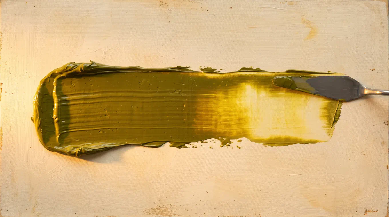
The painter James Gurney puts it in working language on Gurney Journey: “The tube color is called the mass tone (or masstone), and the color when thinned down is called the undertone.” His example is Azo Green watercolor, which has a dull olive-green masstone and, thinned, a strong yellow undertone. Read the tube and you would never reach for it to paint a yellow. Read the thin film and you would.
Bruce MacEvoy’s handprint, a detailed public reference on watercolor pigments, breaks down what changes between the two. Diluted, a paint shows a lighter value, a lower chroma, and usually a slightly different hue, which he calls the hue shift. The first two are obvious. The third is the undertone, and it is the one that matters for mixing. MacEvoy also notes an exception worth knowing: in many dark red, purple, blue, and green paints, dilution actually raises chroma up to a point, which is why some deep pigments look more vivid thinned than they do thick.
Manufacturers print this on their own product pages. Gamblin describes Perylene Red as an “elegant modern red with yellow undertone,” and its Manganese Blue Hue as a “cool, transparent blue with green undertone.” Those are not poetic descriptions. They are mixing instructions.
The drawdown, where the undertone shows
The test that reveals an undertone has a name in the paint trade. It is called a drawdown: a film of paint drawn down over a white card, thin and even, so the white reads through it. Golden Artist Colors publishes drawdown color charts of its paints for exactly this reason, because a chart of masstone swatches would tell a painter half of what they need.
The reason thinning works is worth understanding rather than memorizing. In a thick film, almost no light reaches the ground. What returns to your eye has been scattered and absorbed within the pigment layer itself, so you are reading the pigment’s surface color. Spread the same paint thin over white and light passes through the pigment, reflects off the white beneath, and travels back out through the pigment a second time. Now you are reading the color the pigment transmits, over a longer, thinner light path, and that is a different reading.
This is why the gap between masstone and undertone is widest in the transparent modern pigments. Golden’s own Sarah Sands notes that cadmiums and cobalts, which are opaque, tend to show similar masstone and undertone, while transparent organics like the quinacridones and phthalos often show undertones quite different from what the masstone would lead you to expect. Opaque pigments never let much light reach the ground, so there is less for the thin film to reveal.
Why undertone decides what a paint can mix
Here is the part that makes undertone practical rather than trivia.
There is no pure primary in a paint box. Every real red leans toward either orange or violet. Every real blue leans toward either green or violet. Every real yellow leans toward either green or orange. The pure primaries of color theory are positions on a wheel. The tubes on your table are positions plus a direction.
A pigment mixes cleanly toward the hue it already leans into, and dirtily toward the hue it leans away from. A violet-leaning red and a violet-leaning blue are both already traveling toward violet, so their mixture arrives somewhere vivid. An orange-leaning red mixed with a green-leaning blue is two pigments pulling in opposite directions across the wheel, and the mixture lands near the middle, which is gray. That is the actual chemistry behind muddy color. Mud is rarely a mistake of hue. It is usually two undertones fighting.
This is the argument of Blue and Yellow Don’t Make Green, Michael Wilcox’s book on color mixing, which is where most painters first meet the idea under the name color bias. The practical result is the split primary palette: carry two of each primary, one leaning each way, and you can reach any clean mixture on the wheel with six tubes. It is also why a deliberately restricted set like the Zorn palette is organized around a warm pole and a cool pole rather than around hue names.
Undertone in this sense overlaps with color temperature but is a finer instrument. Temperature asks warm or cool. Undertone asks which way, exactly. Two reds can both be warm and still be useless substitutes for each other.
Why paint labels say green shade and red shade
Look at a professional paint range and you will find the undertone printed in the product name itself.
Winsor and Newton sells Ultramarine (Green Shade) and describes it as “a rich deep transparent blue with green undertones, differing from the red undertones of French Ultramarine.” It sells Phthalo Blue (Green Shade) as “a deep intense blue with a green undertone.” The parenthetical is not decoration. It is the manufacturer telling you which mixtures the tube is good for, because they know that is the question a painter is actually asking.
Two blues that read almost identically in the tube, sold under nearly the same name, separated only by their lean. One makes clean violets. The other makes clean greens. Neither does both well. If you have ever bought a blue and found your purples went gray, you bought the wrong shade, not the wrong blue.
Why your new gray wall looks purple
The paint chip was gray. The wall is purple. Nobody switched the can.
Gray paint is not made from grayness. It is mixed from colored pigments, and whatever bias survives that mix is the undertone. Arriving at gray means getting colorants to cancel each other, and they never cancel perfectly. Whatever survives is the lean. On a two inch chip against a white card in a store, that residue is invisible. On four walls, against your floor, your trim, and your sofa, it has something to be compared to, and comparison is the only condition under which an undertone is visible at all.
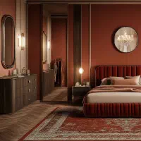
Light finishes the job. Farrow and Ball notes that “northern light tends to bring out the cooler tones within a colour,” and advises against blue or gray based light tones in north facing rooms for that exact reason. A gray with a violet lean in a north facing room is a violet wall by four in the afternoon. The same gray in warm evening lamplight goes quiet and reads as a soft taupe. The paint has one undertone. The room supplies a different reference every few hours.
This is also the thing that is genuinely hard to explain to a client, because “trust me, it has a violet undertone” is not evidence. Showing the warm and cool structure of a room, and of the reference image the client brought, turns a taste argument into a visible one. That shift, from opinion to evidence, is the same move that makes it possible to justify a color palette to a client at all.
How to find the undertone of a paint yourself
Two tests, both cheap.
Thin it over white. In watercolor or ink, dilute heavily and brush it across white paper. In oil or acrylic, scrape a thin film across a white card with a palette knife, or mix a small amount into a pile of white. Compare the thin film against the thick swatch of the same paint, side by side, on the same card. The thin film will be lighter, usually duller, and slightly shifted in hue. The shift is the undertone. Note that handprint, working in watercolor, treats undertone and tint as the same reading, since in a transparent medium dilution and tinting produce the same thing. In opaque media they diverge, so do both.
Mix it and watch where it goes. Take the paint you are unsure about and add a known partner, then look at where the mixture lands. Add a blue to a red and see whether the result heads toward a clean violet or toward brown. Clean means the two undertones agree. Brown means they do not. This test is slower but it answers the question you actually care about, which is not what the pigment looks like but what it will do.
Both tests are really the same instruction: stop looking at the color alone. Give it something to be compared against. That is the only way an undertone becomes visible, and it is why a printed swatch book has never been enough for anybody.
How to see undertone in an image
Comparison works well for two swatches on a card. It falls apart on a photograph or a painting, where there are thousands of colors and your eye is actively working against you. Color constancy, the mechanism that keeps a white shirt looking white under lamplight and daylight alike, is your visual system correcting the exact information you are trying to read. The harder the call, the harder it compensates.
Undertone is built to show that information directly. Its Temperature view reads every pixel’s hue and saturation, then maps where color leans warm and where it leans cool, with near neutral areas draining to gray because they carry no temperature signal. An undertone is a lean, and this is a map of leans across a whole image. It also reports the overall bias of the picture as warm, cool, or balanced, which is the single fastest way to check whether the reference you are working from actually does what you think it does.
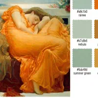
The palette view goes the other direction. It extracts the colors an image is actually built from, sized by how much of the picture each one occupies, and names each against a library of real artist pigment names rather than hex codes, so a color you are looking at connects back to a tube you can pick up. Alongside those, a value structure view and a saturation view break the same image into its tonal and chroma skeletons. Everything runs on the device, with no account and no upload, which means the image never leaves your phone. The Temperature, palette, value, and saturation views are all in the free tier.
That combination is the practical answer to the whole topic. You cannot judge an undertone in isolation, and a map removes the need to. It is also the fastest way to run a color study or to check whether a painting’s chroma structure is doing what you intended, and to recognize which color harmony a reference is built on.
Learn to read undertone and a lot of color problems stop being mysterious. The violet wall, the dead purple, the muddy shadow, and the two reds that refuse to behave the same way are all one problem seen from four angles. A color is not a point. It is a point and a direction, and the direction is the part that decides what happens next.
Undertone analyzes any painting or photograph across multiple dimensions: palette, harmony, temperature, value structure, composition, saturation, and contrast. All on-device, one-time purchase, no subscription. Available for iOS and iPadOS, macOS, and Android.