Anders Zorn painted some of the most admired portraits and figures of the late 19th century using a palette of four colors: yellow ochre, vermilion, ivory black, and lead white. This restriction was not poverty. It was a deliberate choice that forced every painting decision through two filters: value and temperature. Understanding why it works reveals more about color than any expanded palette can teach.
The painter
Anders Zorn was born in 1860 in Mora, a village in Dalarna, central Sweden. He entered the Royal Swedish Academy of Arts in Stockholm at fifteen and astonished his teachers. By his thirties he was one of the most sought-after portrait painters in the world, painting three U.S. presidents, European aristocrats, and American industrialists. He moved between Stockholm, Paris, and the United States with the ease of someone who understood that talent was portable.
His early work was in watercolor, meticulous and precise. By 1887 he had shifted decisively to oils, and his brushwork became broader, more confident, almost aggressive. Look at any of his mature paintings and you see strokes that describe form, light, and material in a single loaded pass of the brush. There is no hesitation. There is no blending.
He returned to Mora in his later years, built a house, collected folk art, and kept painting. He died there in 1920, at sixty. The house and its contents became the Zorn Museum, which today holds the world’s largest collection of his work.
The four colors
The palette attributed to Zorn consists of:
Yellow ochre. An iron oxide pigment, warm and opaque, one of the oldest pigments in continuous use. It provides the middle range of the palette, the golden tones that form the foundation of skin in warm light.
Vermilion. A mercury sulfide pigment, intensely warm, the most saturated color on the palette. Modern painters typically substitute cadmium red light for reasons of toxicity and availability. It provides the warmest accents: lips, flushed skin, the glow of blood beneath the surface.
Ivory black. A carbon-based pigment made historically from charred bone or ivory, classified as PBk9. It is the only cool element on the palette, and its behavior is the key to why the whole system works.
Lead white. Dense, warm, and highly opaque. Modern painters use titanium white, which is cooler and more opaque, or a mix of titanium and zinc. White controls value. It is the light.
These four pigments are not random. They are structurally complete in a way that rewards close examination.
Why ivory black is secretly blue
The science that makes the Zorn palette function is the chromatic bias of ivory black.
Pure black, in theory, absorbs all wavelengths equally. No pigment actually does this. Every real-world black pigment absorbs some wavelengths more than others, which gives it a subtle color lean. Ivory black (PBk9) absorbs warm wavelengths more efficiently than cool ones. The result is that when you lighten it with white, the tint does not read as neutral gray. It reads as blue-gray.
This is not subtle. Mix ivory black and white on a palette next to a pile of yellow ochre, and the cool lean is obvious. In context, surrounded by the warm ochre and vermilion, this blue-gray reads even cooler.
This means the Zorn palette is not a palette of one hue plus black and white. It is a palette with a warm family (vermilion, yellow ochre) and a cool family (ivory black), bridged by white. It is a temperature system.
And because ivory black functions as a desaturated blue, mixing it with yellow ochre produces green. Not a vivid green. A muted, earthy olive that is exactly what you see in the shadow side of flesh lit by warm light, in the reflected cool of a landscape, in the neutral tones of fabric. Mix ivory black with vermilion and you get muted violets and warm browns. Add white to any of these and you get a range of tinted grays that cover a surprising span of the color wheel.
The palette cannot produce saturated blues, greens, or violets. It does not need to. For the subjects Zorn painted most, portraits and figures in controlled light, the desaturated versions of these hues are exactly what appears in nature.
What Zorn actually used
The popular account says Zorn only ever used four colors. The historical record is more interesting than that.
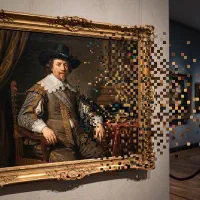
In 1896, Zorn painted Self-Portrait with Model, now at the Nationalmuseum in Stockholm. He depicted himself in his Paris studio, wearing a white painter’s coat, holding palette and brush, with his model seated behind him. The palette in the painting clearly shows four colors: white, ochre, red, and black. He was advertising his method.
The American painter Birge Harrison, in his 1909 book Landscape Painting, wrote: “The distinguished Swedish artist, Zorn, uses but two colors, vermilion and yellow ochre; his two other pigments black and white, being the negation of color.”
But when Zorn died in 1920, his studio in Mora contained 243 tubes of paint, including 17 tubes of cobalt blue. Birgitta Sandstrom, former director of the Zorn Collections, questioned whether Zorn truly maintained the strict four-color palette, noting the presence of blues and greens in some of his work.
The most rigorous investigation came from Emma Jansson, whose doctoral research at Stockholm University resulted in the book Zorn’s Studio: The Artist’s Materials and Techniques (2022). Using X-ray fluorescence spectroscopy and paint cross-section analysis, Jansson identified additional pigments in some paintings: cobalt blue, viridian, cadmium yellow, emerald green, burnt sienna, madder lake, and ultramarine blue.
The truth is the most useful version: Zorn used the four-color palette for a large portion of his output, particularly portraits and figures, but he was not dogmatic about it. When a painting demanded a color outside the four-pigment gamut, he used it. The palette was a preferred working method, not a religious constraint.
This makes it more interesting, not less. He chose the restriction when it served the painting. He knew what the restriction gave him and when it cost too much.
What the restriction gives you
Painting with four colors removes the most seductive distraction in oil painting: chroma.
A painter with a full palette can always reach for a more saturated tube when something looks wrong. Muddy shadow? Throw some ultramarine at it. Dull skin? Add a spot of cadmium orange. These solutions often create new problems because they address symptoms rather than causes. The shadow was not muddy because it lacked blue. It was muddy because the value was wrong.
The Zorn palette eliminates this escape route. With low-chroma pigments, you cannot fix value problems with color. You have to see value accurately, mix it accurately, and place it accurately. If the light side of the face does not separate from the shadow side, you cannot solve it by making one side bluer. You have to get the value step right.
This is why the palette has persisted as a teaching tool for over a century. It does not teach you to paint like Zorn. It teaches you to see value, which is the prerequisite for painting like anyone.
The atelier progression
The classical atelier tradition, which descends from the apprenticeship model of European master workshops, structures its painting curriculum around a specific progression. The Zorn palette sits at a critical midpoint.
Stage one: monochrome. Students paint in black and white only. No color at all. The entire focus is on value: seeing it, mixing it, placing it. This stage can last months.
Stage two: the Zorn palette. Students add yellow ochre and vermilion (or cadmium red) to the black and white. Now they must manage value and temperature simultaneously, but with limited chroma, so the value discipline from stage one remains the primary structure.
Stage three: full color. Students expand to a complete palette. By this point, they have internalized value relationships so deeply that color becomes an addition to a solid structure rather than a substitute for one.
Watts Atelier in Encinitas, California, founded by Jeff Watts in 1992, uses this progression explicitly. Students begin in gouache, working first in monochrome, then adding one color, then moving to the full Zorn palette before graduating to full color in oils. Juliette Aristides, in her book Lessons in Classical Painting, includes a Zorn palette mixing grid as a teaching exercise. The Madrid Academy of Art and numerous other classical programs worldwide follow similar sequences.
The logic is not that four colors are better than forty. It is that four colors force you to solve the right problems first.
Temperature as structure
The deeper lesson of the Zorn palette is that color temperature is not decoration. It is structure.
In representational painting, light has temperature. Warm light (sunlight, incandescent light) produces cool shadows. Cool light (north light, overcast sky) produces warm shadows. This temperature relationship is how the visual system reads form, depth, and atmosphere. A face lit by warm light will have golden highlights and blue-gray shadows. A face lit by cool north light will have cooler highlights and warmer, more ochre shadows.
The Zorn palette maps directly to this. Vermilion and yellow ochre handle the warm side. Ivory black handles the cool side. White modulates value across both. Every mixture you make on the Zorn palette is explicitly a decision about warm versus cool, which means every stroke you place is a temperature statement.
This is why paintings made with the Zorn palette can look far more colorful than their four ingredients suggest. The eye does not need saturated blue to read a shadow as cool. It needs a temperature shift relative to the adjacent warm note. A gray mixed from ivory black and white, placed next to a warm note of ochre and vermilion, reads as definitively cool. Context does the work that chroma usually gets credit for.
A 2,400-year-old idea
Zorn was not the first painter to use a restricted palette of red, yellow, black, and white. He was not even close to the first.
Pliny the Elder, writing in the first century CE, described the palette of the ancient Greek painter Apelles of Kos. According to Pliny’s Natural History (Book 35), the great painters of the Classical period used four colors: a white (melinum), a yellow (Attic sil), a red (Pontic sinopis), and a black (atramentum). “Four colours only,” Pliny wrote, “were used by Apelles, Aetion, Melanthius, and Nicomachus in their immortal works.”
The pigments differ. The principle is identical. Red, yellow, black, and white give you a complete system: a value range from light to dark, a temperature range from warm to cool, and enough chromatic range to describe the natural world of human skin, earth, sky, and fabric.
Twenty-four centuries of painters have confirmed that this is enough.
Seeing the structure
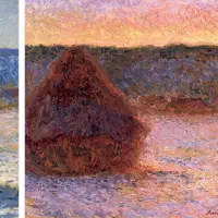
If you photograph a Zorn painting and analyze its color structure, something instructive appears. The palette is narrow. The proportions are dominated by ochre and neutral tones. The temperature map shows clear, decisive zones: warm in the light, cool in the shadow, with transitions that are sudden rather than gradual. The value structure is strong, with a limited number of clearly separated value steps.
This is what the restricted palette enforces. By removing the option of chromatic variety, the painter is left with value contrast and temperature contrast as the only tools for creating form. And these are the tools that matter most. A painting with perfect chroma but wrong values looks broken. A painting with muted chroma but accurate values reads as light falling on form.
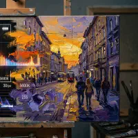
When you use Undertone to analyze a painting made with a Zorn-type palette, the analysis reveals this directly. The palette extraction shows how few colors are actually present. The color harmony layer shows how those few colors relate. The temperature map shows the warm-cool architecture. The value structure shows the tonal skeleton that holds everything together. The painting works not because of the colors, but because of the relationships between them.
This is the same insight that the Heian courtiers encoded in their kasane no irome system: color harmony is not about individual colors. It is about how they interact. Whether you are analyzing layered silk robes from 10th-century Kyoto or a Zorn portrait from 1896, the question is the same. What is the structure?
The lesson
Zorn did not paint with four colors because he could not afford more. He painted with four colors because he understood that most of what makes a painting work is not color at all. It is value. It is temperature. It is the confident placement of a loaded brush on a surface.
The restriction did not limit what he could say. It clarified how he said it. This is the paradox that every painter eventually encounters: less choice forces better decisions. A palette of forty colors gives you forty ways to avoid solving the actual problem. A palette of four gives you nowhere to hide.
If you want to understand why a painting works, start by looking at what the painter chose not to use. That is where the discipline lives. And discipline, in painting, is not the opposite of expression. It is the foundation of it.
Undertone analyzes any painting or photograph across multiple dimensions: palette, harmony, temperature, value structure, composition, saturation, and contrast. All on-device. Available for iOS, Android, and macOS.