Photographers and painters look at the same image and see different things. Not because one sees more than the other, but because each discipline trains you to extract different information. Photographers see tonal range, color casts, and exposure. Painters see temperature relationships, value structure, and pigment proportions. The overlap between these two ways of seeing is where both disciplines get sharper.
Two people, one photograph
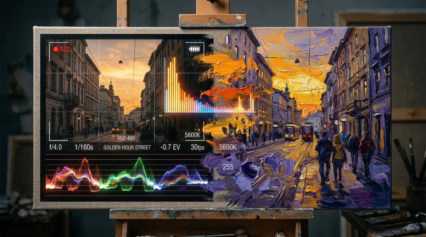
Take a photograph of a street at golden hour. Hand it to a photographer and a painter.
The photographer sees the histogram. The shadows are dense but not clipped. The highlights are warm but still hold detail. The white balance is around 5500K, maybe a touch toward amber. There is a complementary relationship between the warm light on the buildings and the cool blue in the shadows. The overall exposure is about a third of a stop over middle gray. The photographer is thinking about how to reproduce this. Lightroom. Camera RAW. Temperature slider. Split toning. Shadows and highlights separated, graded independently.
The painter sees something else entirely. The warm light on the building facades is not “5500K.” It is a temperature bias. The light-struck surfaces lean toward cadmium yellow, maybe yellow ochre. The shadows are not “cool.” They are a specific kind of cool. Violet-blue, not green-blue. The painter notices that the shadow color is the complement of the light color. Not because they measured it, but because years of mixing paint taught them that warm light produces cool shadows, and cool light produces warm shadows. It is not a slider. It is a relationship.
Same image. Different extractions. Neither is wrong.
The vocabulary gap
The interesting thing is not that these disciplines see different things. It is that they have developed entirely separate vocabularies for the same phenomena.
Temperature. In photography, temperature is a number. Kelvin. The Lightroom temperature slider runs from blue to yellow, and you drag it until the image looks right. A photographer corrects for temperature. The goal is often neutrality, or a deliberate deviation from it. In painting, temperature is relative and contextual. There is no number. A cerulean blue is cool next to ultramarine, but warm next to phthalo blue. Temperature is not a setting you apply to the whole image. It is a negotiation that happens at every brushstroke, in every color relationship on the canvas. Painters do not correct for temperature. They compose with it.
Value. Photographers read histograms. A graph, left to right, dark to light. They look for clipping. They check if the tonal range is using the full latitude of the sensor. Painters squint. Literally. They narrow their eyes to blur the details and collapse the image into three or four zones of light and dark. Ansel Adams formalized this for photography with his Zone System: 11 zones from pure black to pure white. Painters have been doing the same thing informally for centuries, just without numbering the zones. Both are looking at value structure. One reads a graph. The other reads the image with defocused eyes. The information is the same.
Palette. A photographer looks at the dominant colors in an image and thinks about color grading. How to push the shadows toward teal. How to warm the highlights. How to create a unified color feel across the frame. A painter looks at the same colors and thinks about proportions. Not just which colors are present, but how much of each. Sixty percent warm ochre with a five percent accent of cobalt blue is a fundamentally different palette than a fifty-fifty split of the same two colors. Photographers think in terms of grading direction. Painters think in terms of weight and proportion. Both are analyzing the same palette, but they extract different dimensions of it.
Harmony. Both disciplines use the color wheel, but they use different ones. Photographers work in additive color, where the complements are red/cyan, green/magenta, and blue/yellow. Painters work in subtractive color, where the complements are red/green, blue/orange, and yellow/purple. This is not a trivial difference. It means that when a photographer identifies a complementary relationship in an image, they are looking at a different pair of colors than a painter would identify as complementary in the same image. Both are correct within their model. The physics are different because the media are different: light versus pigment.
Where painters are ahead
Painters have a few centuries head start on thinking about color relationships. Some of what they know has not fully crossed over to photography.
Temperature as structure. Painters learn early that the single most powerful tool for creating the illusion of light is the interplay between warm and cool. Warm light, cool shadows. Cool light, warm shadows. This is not a rule about color. It is a rule about how human vision perceives illumination. A painting where every surface is the same temperature looks flat, no matter how strong the value contrast is. Photographers know about split toning, adding warm tones to highlights and cool tones to shadows. But they often apply it as an aesthetic choice, a grade. Painters apply it as physics. The distinction matters.
Proportional thinking. Most palette extraction tools give you five flat swatches in equal rectangles. A painter looks at that and sees nothing useful. Knowing that an image contains ochre and blue tells you almost nothing. Knowing that the image is 60% warm neutrals, 25% mid-value greens, 10% dark blue-violets, and 5% bright warm accents tells you how the palette is structured. Proportion is the information that separates “those are the colors” from “that is why the colors work.” Photographers are trained to think about color in terms of direction (warmer, cooler, more saturated, less saturated). Painters are trained to think about color in terms of territory: how much of the canvas each color occupies.
Relative color judgment. A painter never evaluates a color in isolation. Every color on the canvas is judged against its neighbors. A gray looks warm if surrounded by cool colors and cool if surrounded by warm colors. The same physical mixture can read as three different colors depending on context. Photography training does address this (the concepts of color constancy and relative perception exist in color science), but the daily practice of painting forces you to confront it at a visceral level. You mix a color, place it on the canvas, and it changes identity because of what is next to it. This experience teaches you something about color that reading about it does not.
Where photographers are ahead
Photography has its own advantages, and some of them are things painters could benefit from.
Precision measurement. Painters work by eye. There is pride in that, and it develops real skill. But it also means that the analysis is always subjective. Two painters can look at the same reference and disagree about whether the shadow is warm or cool, because their eyes are calibrated differently. Photographers have instruments: histograms, scopes, white balance readings, colorimeters. These do not replace the eye. But they provide a shared reference point that eliminates certain categories of argument. When a photographer says the shadow has a blue color cast of 7500K, that is a measurement anyone can verify.
Systematic reproduction. A photographer who nails a color grade can save it as a preset and apply it to a hundred images. The system is explicit and repeatable. A painter who mixes a beautiful color on the palette and lays it down perfectly has done something that is much harder to repeat. The knowledge is tacit. It lives in muscle memory and visual judgment, not in a settings file. This is part of what makes painting difficult and rewarding. But it is also why painters sometimes cannot explain, even to themselves, why something worked.
Tonal range awareness. Photographers are trained to think about the full tonal range of their sensor. Clipping, latitude, dynamic range. These are technical concepts, but they develop a specific kind of seeing: an awareness of whether an image is using the full range from black to white, or whether it is compressed into the midtones. Painters develop this awareness too, eventually, but photography training installs it earlier and more explicitly.
The overlap is the interesting part
The real insight is not that these disciplines are different. It is that the overlap between them contains knowledge that neither discipline teaches well on its own.
A photographer who understands temperature the way a painter does will make better color grading decisions, because they will stop thinking of warm and cool as aesthetic preferences and start thinking of them as structural relationships that create the perception of light.
A painter who understands histograms will stop arguing about whether a shadow is a value three or a value four, because they will have a shared reference that makes the conversation concrete.
Both disciplines analyze the same four things: what colors are present and in what proportion, how those colors relate to each other geometrically, where the warm and cool live in the image, and how the lights and darks are structured. They just use different words for it. Different tools. Different traditions. But the underlying phenomena are identical.
A shared vocabulary
This is what Undertone was built for. Not as a photography tool or a painting tool, but as a color analysis tool that speaks both languages.
Point it at any image and it gives you four layers of analysis. The palette with proportions: not flat swatches, but colors weighted by how much of the image they occupy, each labeled with hex codes and painter-friendly pigment names like Burnt Sienna and Payne’s Gray. The color harmony: the geometric relationship plotted on an HSV color disc, whether it is complementary, analogous, triadic, split-complementary, or something else. The temperature map: a per-pixel warm/cool overlay computed on your device, showing exactly where the warm ends and the cool begins. And the value structure: the image stripped to grayscale and divided into dark, mid, and light zones using Otsu’s multi-level thresholding, a computer vision algorithm that finds the natural tonal breakpoints instead of splitting the range into arbitrary thirds.
A photographer looks at the temperature map and sees what their split toning is actually doing. A painter looks at it and sees the warm-light/cool-shadow structure they have been trying to identify by squinting. Same map. Different insight. Both useful.
A photographer looks at the palette proportions and understands, for the first time, why that golden hour shot works when the same colors at different ratios do not. A painter looks at it and sees the color notes they need to mix, in the order they need to lay them down.
The analysis does not change depending on who is looking. What changes is what you take from it.
Why this matters
Most people who work with color seriously, whether they hold a camera or a brush, eventually hit the same wall. You can see that something works, but you cannot see why it works. You can feel that a photograph is beautifully graded, but you cannot name the harmony. You can tell that a painting has luminous light, but you cannot isolate the temperature structure that creates it.
The vocabulary gap between photography and painting is not just a curiosity. It is a real obstacle. Photographers who study painting get better at color. Painters who understand photographic analysis get more precise. The cross-pollination is real, and it is underused.
Undertone does not teach you photography or painting. It shows you what both disciplines are always looking for, in a language that both can read.
Undertone analyzes any painting or photograph across multiple dimensions: palette, harmony, temperature, value structure, composition, saturation, and contrast. All on-device. Available for iOS, Android, and macOS.