A value study is a simplified tonal version of your subject, reduced to a few levels of light and dark, that you complete before painting. It strips away color so you can see whether the underlying structure of light works. If the values are wrong, the painting fails regardless of how accurate the color is. This guide covers why value studies matter, how the old masters used them, and how to make one.
Why values come first
Every painting is a value structure with color laid on top. When you squint at a painting and it reads clearly across the room, that is values doing the work. When a painting feels flat or confused despite accurate drawing and careful color mixing, that is almost always a value problem.
John Singer Sargent put it directly: “Color is an inborn gift, but appreciation of value is merely training of the eye, which everyone ought to be able to acquire.” For Sargent, value was the trainable skill that separated competent painters from struggling ones. He advised students to begin with the middle tones, work toward the darks, and place the highest lights and darkest darks last. “If you begin with the middle-tone and work up from it toward the darks,” he told his students, “so that you deal last with your highest lights and darkest darks, you avoid false accents.”
This was not optional advice. It was his method.
What old masters knew about tonal planning
Rembrandt and chiaroscuro
Rembrandt did not stumble into his dramatic lighting. He planned it. His preparatory drawings on toned paper, using brown and white crayons for highlights and shadows, were tonal studies. He began with the darkest areas and finished with the highlights, building outward from a middle-tone ground. His chiaroscuro was not simply a matter of putting light next to dark. He animated his shadows with subtle reflected light and controlled the transitions between illuminated and shadowed areas with a precision that required planning before paint.
Vermeer and the underpainting
Modern X-ray and infrared analysis of Vermeer’s paintings reveals a consistent process. He prepared canvases with a warm grey or beige ground, then used an early monochrome layer to establish value relationships without the added complexity of color. Scientific research published by the Journal of Historians of Netherlandish Art confirms that Vermeer repositioned figures and objects during this underpainting stage, refining the tonal structure of the composition before applying color. The darks stayed thin and transparent. The lights were built up in thicker, more opaque layers. This was deliberate tonal planning, not improvisation.
Sargent and value grouping
Sargent simplified. Instead of rendering every tonal gradation he observed, he grouped similar values together and reduced the tonal structure to a few decisive planes. His unfinished portraits show this clearly: broad areas of a single value defining the light side of a face, another value for the shadow side, with minimal gradation between them. He maintained a strong separation between light and shadow throughout the painting, which prevented the muddiness that comes from overworking transitions.
Sorolla and the value of light
Joaquin Sorolla painted some of the most convincing outdoor light in the history of Western painting. His method depended on value control. He painted shadows at a mid-grey value or darker, which gave him room at the lighter end of the scale to push highlights and convey the impression of bright sunlight. The value structure came first. Then he shifted the colors, pushing lights toward yellow and shadows toward blue or violet, to amplify the sensation of light. Without the correct value foundation, those color shifts would have looked arbitrary.
Zorn and the limited palette
Anders Zorn (1860-1920) painted with a restricted palette of yellow ochre, vermilion, ivory black, and white. Four colors. The physical palettes preserved at the Zorn Museum in Mora, Sweden show prominent wear patterns on these four pigments, with only faint traces of others. When you reduce your palette to four colors, you cannot rely on chromatic variety to create the illusion of form. You must use value. The Zorn palette forces you to think tonally, which is why many ateliers use it as a teaching tool.
The concept of notan
Before Western painters formalized value studies, Japanese artists had a word for the harmony of light and dark: notan. The term was introduced to American art education by Ernest Fenollosa, a curator of Oriental Art at the Boston Museum of Fine Arts, and later popularized by Arthur Wesley Dow in his 1899 book Composition: Understanding Line, Notan and Color. That book became one of the most influential art education texts in America. Georgia O’Keeffe read it and said it changed how she saw.
Notan, in practice, means reducing an image to just two values: black and white. No gradation, no middle grey. Just the fundamental division between light and dark. This two-value reduction tests whether the abstract pattern of your composition is strong enough to carry a painting.
A good notan reads as a compelling design even without subject matter. The shapes of light and the shapes of dark interlock and create visual tension. A weak notan produces an image where the light and dark shapes are scattered, disconnected, or evenly distributed without emphasis.
Notan is the most radical form of value study. It asks the most basic question: does the fundamental light-dark structure of this image work?
The Munsell value scale
In 1905, Albert Munsell, a painter and instructor at the Massachusetts Normal Art School (now the Massachusetts College of Art and Design), published A Color Notation, which described a systematic approach to color, the Munsell color system, based on three attributes: hue, value, and chroma. His value scale runs from 0 (pure black) to 10 (pure white), with perceptually even steps between them.
What makes the Munsell scale relevant to painters is that it separates value from hue and chroma. You can have two colors that look very different, say a warm orange and a cool blue, but share the same Munsell value. When you convert them to grayscale, they become the same grey. This is precisely why value studies work: they reveal tonal relationships that color can obscure.
Most value studies use between 3 and 5 levels, which corresponds roughly to grouping the Munsell 0-10 scale into broad bands. A 3-value study might use values around 2, 5, and 8. A 5-value study divides the range more finely. The point is not precision. The point is seeing the structure.
How to do a value study
By hand
-
Start small. Work on paper no larger than 5x7 inches. Value studies are planning tools, not finished works. Small size forces simplification.
-
Choose your values. Three is the minimum for useful planning. Five is the practical maximum before the study becomes as complex as the painting. Decide before you start: how many levels of tone will you use?
-
Block in the darkest darks first. Identify the areas of your subject that will be the darkest value. Fill them in as flat shapes. Do not model, do not blend. Flat tones.
-
Add the lightest lights. These are the areas of strongest illumination. Again, flat shapes.
-
Fill in the midtones. Everything between the extremes. If you are using three values, you have one midtone. If you are using five, you have three.
-
Squint and evaluate. Step back. Squint at the study. Does it read clearly? Can you identify the subject and the light direction from across the room? If not, your value grouping needs adjustment.
Materials: vine charcoal on newsprint, a grey marker set, or diluted ink all work. Anything that lets you lay down flat values quickly.
With Overgrid
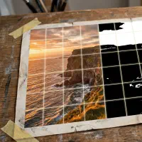
Overgrid includes a value study tool that reduces any reference photo to a specified number of tonal levels. The feature works by converting each pixel to its luminance value, then mapping that luminance to the nearest level in your chosen range.
Here is how to use it:
-
Import your reference photo. Open a project in Overgrid and load your image.
-
Enable the value study. Toggle the value study overlay in the editor. The image immediately reduces to the default of 5 tonal levels.
-
Adjust the number of levels. The slider moves from 2 to 8. Start at 2 for a notan view, showing just light and dark. Move to 3 or 4 for a composition study. Move to 5 through 8 when you want to plan specific tonal passages.
-
Change the tone color. By default the value study renders in blue tones, but you can switch to any color: red, white, yellow, or a custom hue. Changing the color does not change the tonal analysis. It changes the palette of the preview, which can help you see the values more clearly depending on the image.
-
Combine with the grid. Layer a grid overlay on top of the value study. This gives you both tonal structure and proportional reference in a single view. Export the result and place it next to your easel.
-
Export and reference. Export the value study as an image to keep beside your canvas while you paint.
The value study feature processes the image on your device. No upload, no cloud processing. The original photo is never altered.
Using both methods together
The most thorough approach combines digital and hand-painted studies. Use Overgrid to generate a quick digital value study and test different numbers of tonal levels. Find the grouping that captures the essential light structure of your subject. Then paint a small hand study using those same value groupings. The digital study tells you the structure. The hand study trains your eye and your mixing.
The practical payoff
A value study completed before painting does three things.
It reveals problems early. A composition that works in color but fails in value will become apparent in the study. You can fix the design before you have hours of paint on the canvas.
It gives you a roadmap. When you are deep in the painting and losing track of the big picture, the value study is your reference point. It shows you what the tonal structure should be when every square inch of the canvas is competing for your attention.
It simplifies color mixing. When you know the target value of a passage before you mix the color, you eliminate half the variables. You can focus on hue and chroma, because value is already decided.
This is why ateliers teach value studies before they teach color. The atelier tradition, which descends from the apprenticeship model of European master workshops, structures its curriculum around a progression from cast drawing to value studies to limited-palette painting to full color. Value is the foundation. Everything else sits on top.
Beyond the study: temperature mapping
Value studies answer the question of light and dark. Temperature mapping answers the question of warm and cool. Together, they give you a complete plan for the two most fundamental aspects of color in painting.
Overgrid includes a temperature overlay that analyzes your reference and maps warm zones (reds, oranges, yellows) and cool zones (blues, greens, violets) across the image. Combined with the value study, this gives you a tonal and chromatic map before you mix a single color.
The old masters understood this intuitively. Sorolla pushed his lights warm and his shadows cool. Rembrandt used warm reflected light in cool shadows. These were not accidents. They were planned relationships, and planning them starts with seeing them clearly.
Start with the structure
A value study is not a creative constraint. It is a way of seeing the painting before you paint it. Rembrandt planned his tonal structure on toned paper. Vermeer built monochrome underpaintings. Sargent grouped his values into decisive planes. Sorolla mapped his value range to leave room for light. These were not shortcuts. They were the method.
Five minutes with a charcoal stick or a tap of the value study toggle in Overgrid can save you hours of corrective overpainting. The painting is already there in the values. You just need to see it first.
Overgrid is available on iOS and Android. The value study feature is part of Premium, a one-time purchase with no subscription. All images stay on your device.