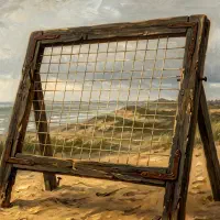
A thousand years before Pantone, before Newton’s color wheel, before any Western theory of color harmony, Japanese courtiers had already codified over 200 named color combinations. Each was tied to a specific season. Each was created through layered translucent silk that mixed colors optically. The system was called kasane no irome, and it remains one of the most sophisticated color harmony frameworks ever devised.
What kasane no irome was
Kasane no irome (襲の色目) translates roughly to “layered color combinations.” It was the formal system governing how colors could be combined in the layered silk robes worn at the Heian imperial court, from 794 to 1185 CE.
The system contained over 200 named combinations. Some sources document more than 260. Each combination was assigned to a specific time of year, sometimes as precise as a particular week within a season. Every combination had a poetic name drawn from nature.
A few examples:
Sakura (cherry blossom). White outer layer over graduated pink. The white silk was thin enough that the pink beneath showed through, producing the exact pale blush of cherry petals in spring.
Kobai (crimson plum). A deep red outer layer graduating through four layers of lightening pink, evoking the red plum blossoms of early spring.
Fuji (wisteria). Pale purple layers graduating to white, worn in late spring when wisteria hangs heavy on the vine.
Momiji (autumn leaves). Red over gold, representing the turning maples of autumn.
These were not arbitrary aesthetic preferences. They were a codified language. Every courtier at the Heian court memorized the correct combinations and could read them on sight, the way a musician reads notation.
How translucency created color
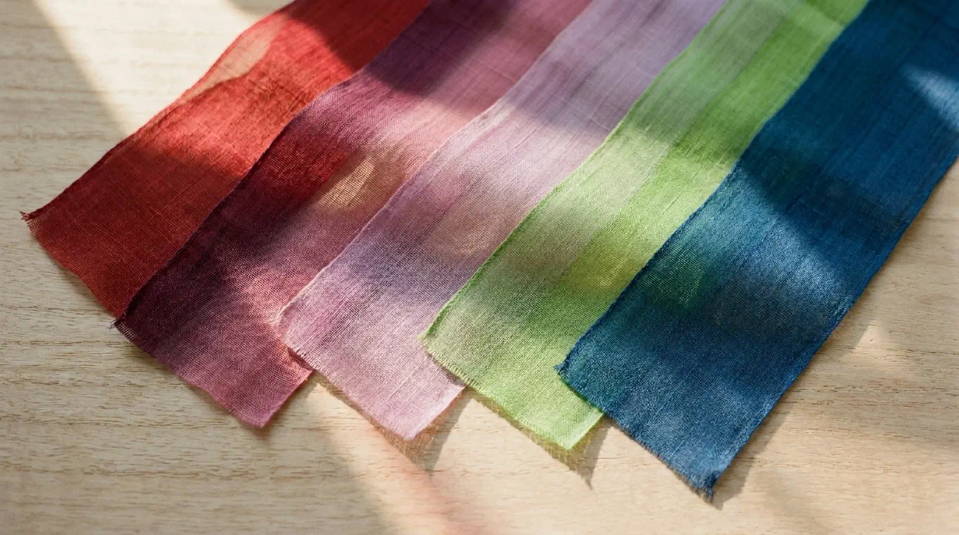
The genius of the system was physical. Heian court robes, particularly the junihitoe (“twelve-layer robe”), were constructed from silk thin enough that underlying layers remained visible. Colors were not simply placed next to each other. They were seen through each other.
A deep crimson layer dyed with safflower (kurenai), covered by a translucent white outer layer, produces a perceived color that is neither red nor white. It is the specific pale pink of cherry blossoms. The same principle at work in oil painting glazes, where a transparent layer of color modifies what is beneath it.
The visible edges of this layering appeared at three points: the collar (eri), the sleeves (sode), and the hem (suso). At these margins, the graduated colors of five or more layers were exposed in thin bands, creating a visible color spectrum that observers could read.
This is optical color mixing through translucency. Not additive (light), not subtractive (pigment), but transmissive. Light passes through multiple layers of dyed fiber, and the eye perceives the result as a single, unified color. The Heian dyers understood this empirically, centuries before anyone wrote the physics down.
The dyes that made it possible
The palette of kasane no irome depended on natural dyes that the Heian dyers had mastered:
Kurenai (crimson). Extracted from safflower petals (benibana). Produces an intense rose-red on silk without any trace of yellow. It was the most prized and expensive dye, sometimes reserved for women of the Imperial family.
Murasaki (purple). Derived from the roots of the gromwell plant (murasaki-gusa). Purple was the color of the highest nobility.
Moegi (spring yellow-green). A fresh, bright green suggesting new growth. Created by combining indigo with a yellow dye.
Ai (indigo). From the indigo plant, producing a range from pale blue to deep navy depending on the number of dips.
These dyes on silk had a particular quality: they were translucent rather than opaque. The fiber absorbed color without becoming a solid block. This meant layering genuinely worked as color mixing, not just concealment.
The social stakes
At the Heian court, your color choices were not private. They were a public statement of taste, education, and rank. The standard was miyabi, courtly refinement, and to lack it was the worst social offense.
Wearing the wrong seasonal combination was a disaster. Not a fashion faux pas in the modern sense, where someone might privately note your mistake. It was a public declaration of ignorance. If any color was off by even a shade, it was considered unacceptable. The wrong combination at the wrong time revealed you as uncultured, the one thing that could not be forgiven in a society built on aesthetic refinement.
The Tale of Genji, written around 1000 CE, is filled with passages where characters assess each other’s layered color choices. Murasaki Shikibu describes combinations with the same precision and social weight that a modern novelist might use for dialogue. The colors spoke. Everyone was listening.
This created an environment where color literacy was a survival skill. You did not just need to know which colors looked good together. You needed to know which specific combination the current week of the season demanded, which shade of pink was appropriate for early plum blossoms versus late ones, which intensity of green signaled new spring versus deep summer.
Seven hundred years before Newton
Isaac Newton published his color wheel in Opticks in 1704. His prism experiments began in 1666. The Western tradition of systematic color theory traces back to these dates.
Kasane no irome was fully developed by the 10th century. The system was already mature, codified, and socially enforced 700 years before Newton split white light through a prism.
This is not to say the systems are equivalent. Newton was describing the physics of light. Kasane no irome was an empirical system built from observation and craft. The Heian courtiers were not doing optics. They were doing something closer to what we now call color analysis: identifying which combinations produce which perceptual effects, cataloguing them, naming them, and building a shared vocabulary around them.
But the result is strikingly parallel. Both systems map the relationships between colors. Both identify harmonies. Both provide a framework for predicting what combinations will produce what effects. The Heian system just arrived first, by a wide margin.
The modern echo
Personal color analysis is now one of the fastest-growing beauty trends in East Asia. Studios in Seoul offer 16-tone seasonal analysis using spectrophotometers to measure exact skin undertone. The principle is the same one that kasane no irome was built on: certain colors interact with certain surfaces to produce specific effects.
In the Heian period, the question was: which silk colors, layered together against skin, create the impression of cherry blossoms? In a Seoul color analysis studio in 2026, the question is: which fabric colors, held against your specific skin tone, make your complexion luminous rather than dull?
The technology changed. The question did not.
This is what makes color analysis feel ancient rather than trendy. It is not a product of Instagram or K-beauty marketing. It is a practice with a thousand-year lineage. The Heian courtiers simply did it with silk and seasonal poetry instead of spectrophotometers and Pantone codes.
Color harmony is observation, not invention
The deeper lesson of kasane no irome is that color harmony was never invented. It was observed and codified. The Heian dyers did not create the fact that red beneath white produces pink. They noticed it, named it, and built a system around it.
Every color harmony system since then has done the same thing. Newton did not invent complementary colors. He observed that certain wavelengths oppose each other. Itten did not invent color temperature. He named a perceptual phenomenon that painters had been using for centuries.
Undertone works on the same principle. Point it at any image and it extracts what is already there: the palette proportions, the color harmony, the temperature structure, the value distribution. It does not impose a system. It reveals the one that already exists in the colors themselves.
The Heian courtiers understood this intuitively. Color relationships are not invented by frameworks. They exist in nature. The frameworks, whether they come from 10th-century Kyoto or a 21st-century app, just make them visible.
Undertone analyzes any painting or photograph across multiple dimensions: palette, harmony, temperature, value structure, composition, saturation, and contrast. All on-device. Available for iOS, Android, and macOS.