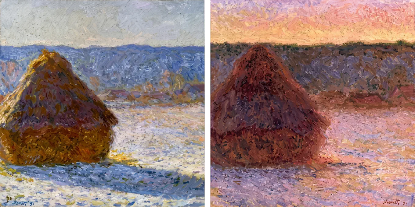
Color temperature is whether a color reads as warm or cool. Warm means reds, oranges, and yellows. Cool means blues, greens, and violets. For painters it is mostly relative: the same yellow is warm beside a blue and cool beside a red-orange. It is the single most useful color idea you can learn, and also the most misunderstood, because the word “temperature” means the opposite thing in photography.
Contents
- The warning that comes first
- The physical scale, and why it runs backward
- The artist’s warm and cool
- Temperature is relative, not absolute
- Every pigment has a temperature bias
- Warm light, cool shadow, and its inverse
- Do warm colors really advance?
- How to actually see temperature
- How Undertone maps temperature
The warning that comes first
Most confusion about color temperature comes from one fact: there are two different things called temperature, and they run in opposite directions.
The physicist’s color temperature, the one on your camera’s white balance slider, says bluish light is a higher temperature than reddish light. The painter’s temperature says blue is cool and red is warm. So the same word points one way for a photographer and the other way for a painter. If you have ever felt that color temperature does not quite make sense, this is why. It is not you. It is two unrelated ideas wearing the same name.
This guide is about the painter’s sense: warm and cool as the eye feels them. But you cannot use it confidently until you have cleanly separated it from the physical scale. So that is where we start.
The physical scale, and why it runs backward
Color temperature in physics is defined by a glowing object called a black body. Heat a black body and it glows: dull red when it is cooler, then orange, then yellow, then white, then bluish-white as it gets hotter. The color tells you the temperature of the object. Blue light means a hotter object, red light means a cooler one.
That gives the counterintuitive result. A candle flame measures about 1,850 K and looks warm and orange. Midday daylight measures roughly 5,500 to 6,500 K and looks cool and blue. The “cool” daylight is physically the higher temperature. The bluest stars are the hottest; the reddest are the coolest. As Wikipedia states it plainly, color temperatures over 5000 K are called cool colors while lower temperatures around 2700 to 3000 K are called warm colors, “exactly the opposite of black-body radiation.”
So when a photographer drags the temperature slider toward higher Kelvin to warm up an image, the software is actually compensating: it assumes the light was bluer and adds orange to balance it. The number and the feeling move in opposite directions. This is the same split a photographer and a painter hit when they describe the identical golden-hour photo, one in Kelvin and one in warm-cool relationships.
Hold onto one sentence: the physical scale measures how hot a light source is, and the artist’s scale measures how warm a color feels, and they are not the same axis. Once that is clear, the rest of temperature is simple.
The artist’s warm and cool
For painters, warm colors are the reds, oranges, and yellows. Cool colors are the blues, greens, and violets. Warm and cool in color theory groups hues from red through yellow as warm, and hues from blue-green through blue-violet as cool, with most grays leaning cool. The association is older than any color science and comes straight from experience: fire and sun are warm and orange, water and sky and shade are cool and blue.
This is a perceptual and psychological fact, not a measurement. There is no instrument that reads a single color and returns “warm.” Warmth is something the eye and the brain assign, shaped by association and by context. That is exactly why it is powerful for painters and useless as a physical quantity. You are not measuring the color. You are reading how it behaves against everything around it.
Temperature is relative, not absolute
Here is the idea that turns temperature from trivia into a tool: warm and cool are almost always relative. A color is warm or cool compared to its neighbor, not in isolation.
Take a yellow-orange. Put it next to a blue and it is unmistakably the warm one. Put the same yellow-orange next to a red-orange and now it is the cooler of the two. The pigment on the brush never changed. Its temperature flipped because its company changed. This is why a painter does not ask “is this warm?” but “is this warmer or cooler than the patch beside it?” Temperature is a comparison, and the comparison is what carries information about light and form.
Every hue contains both possibilities. There is a warm red and a cool red, a warm green and a cool green, a warm gray and a cool gray. A red leaning toward orange is warm. The same red nudged toward violet is cool. The hue is still “red,” but it now sits on the other side of the temperature line. Learning to see this lean inside a single hue is most of what learning to see temperature means.
Every pigment has a temperature bias
Pigments are not neutral examples of their hue. Each one leans warm or cool, and that lean is called its bias. The bias decides what the pigment can cleanly mix, which is why painters choose pigments in warm-cool pairs.
The canonical pairs, confirmed across pigment references:
- Red. Cadmium Red leans toward orange and is the warm red. Alizarin Crimson leans toward violet (it carries a blue bias) and is the cool red.
- Yellow. Cadmium Yellow leans toward orange and is the warm yellow. Lemon Yellow, also sold as Cadmium Lemon or as the Hansa yellows, leans toward green and is the cool yellow.
- Blue. Ultramarine leans toward violet, “a purple bias rather than a green bias,” and is the warm blue. Phthalo Blue and Cerulean Blue lean toward green and are the cool blues.
The reason this matters is mixing. A pigment mixes cleanly toward the hue it already leans into and muddily toward the hue it leans away from. Ultramarine, leaning violet, makes a clean purple with a violet-biased red but a dull green with yellow. Phthalo, leaning green, does the reverse: clean greens, muddy purples. Choose the bias that points toward the color you want, and the mixture stays alive. Choose the wrong bias and you are mixing across the wheel toward gray, which is the chemistry behind muddy color. The same logic is why a restricted set like the Zorn palette is built around a warm pole and a cool pole rather than around hues.
Warm light, cool shadow, and its inverse
The most quoted temperature rule in painting is “warm light, cool shadow.” It is true often enough to be worth knowing and wrong often enough to be worth understanding rather than memorizing.
The reasoning is about light sources, not pigment. A shadow is not the absence of light; it is a region lit by a different light than the lit side. Outdoors on a sunny day, the lit side of a form is struck by warm yellow sunlight. The shadow side is turned away from the sun and is instead lit by the cool blue sky. Two different light sources, two different temperatures. The lit plane goes warm, the shadow plane goes cool, and the gap between them reads as sunlight and air.
Reverse the light source and the rule reverses with it. Under a cool overcast sky or cool north-facing window light, the dominant illumination is cool, and shadows, fed by warmer reflected light from the ground and surrounding objects, tend to read warmer. So the honest version is not “shadows are cool.” It is “shadows are whatever temperature the light reaching them is.”
James Gurney, the painter who wrote Color and Light: A Guide for the Realist Painter, makes exactly this correction. He recommends thinking “warm light, cooler shadows, and cool light, warmer shadows,” with cooler and warmer as comparisons rather than fixed colors, and he cautions against treating it as a formula at all. His advice is to understand which light sources, including reflected light, are actually striking each plane, and let that decide the temperature. A plane facing down toward warm sunlit ground picks up warmth; a plane facing up toward the blue sky picks up cool. The rule is a default, and the default is overridden by the real light in the scene. For the shadow-specific version of this, with how masters like Sorolla and Sargent used it, see why your shadows look muddy.
Do warm colors really advance?
You will hear that warm colors advance and cool colors recede, so warm objects feel closer and cool ones feel farther. This is a useful generalization with real caveats, not a settled law. It is worth being honest about where it holds and where it breaks.
There is a genuine optical effect underneath it called chromostereopsis: because the eye focuses different wavelengths at slightly different points, red often appears to sit on a nearer plane than blue. But the effect is unreliable. Wikipedia notes that it “is not true for everyone, as some people see the opposite and others no effect at all,” and that it can reverse depending on the background and on the viewer’s own pupils. It is an illusion that varies from person to person, not a dependable depth cue.
In practice, value and chroma do far more of the work than temperature does. The landscape painter Mitchell Albala calls the rule “a simplistic guideline that doesn’t take into account other additional factors,” and points out that paint handling, opacity, value, and saturation routinely override it. A warm color that is dark and dull will recede. A cool color that is light and vivid will advance. Even Wikipedia’s own entry on warm and cool notes that the advancing effect is largely attributable to warm pigments simply being higher in saturation and value, since “brown is a dark, unsaturated warm color that few people think of as visually active.”
The honest takeaway: use warm-advances-cool-recedes as a first guess, then check it against value and chroma, which are the stronger forces. Temperature nudges depth. Value and saturation decide it.
How to actually see temperature
Seeing temperature is hard for a specific reason: the eye is built to ignore it. The brain constantly corrects color so that a white shirt looks white under warm lamplight and cool daylight alike. That correction, color constancy, is the same mechanism that hides the temperature shifts you are trying to paint. Your visual system is actively erasing the information you want.
The classic workaround is to compare, not to judge alone. Squint to collapse detail and look at two areas at once: is the shadow warmer or cooler than the light, is the sky warmer or cooler than the water. You are not asking the absolute question, which your eye answers badly. You are asking the relative one, which it answers well. Isolating colors through a small hole punched in gray card helps for the same reason: it removes the surroundings the brain uses to “correct.”
But comparison by eye still fights color constancy, and the harder the temperature call, the more the brain compensates against you. This is the point where measurement beats intuition.
How Undertone maps temperature
Undertone is built to show the temperature your eye is trained to ignore. Its Temperature view runs a per-pixel warm-cool analysis on any photo or painting and maps every pixel to its warm or cool pole, so the warm-cool structure you cannot reliably judge becomes something you can simply look at.
It works by reading each pixel’s hue and how saturated it is, classifying that hue as warm or cool, and weighting it by its saturation so vivid colors count and near-neutral ones do not. Warm pixels are pushed toward their warm pole, cool pixels toward their cool pole, and the neutrals drain to gray, so the image reads as its own temperature contrast: where the warmth lives, where the cool lives, and how much of the picture is neither. It also reports the overall lean of the image as warm, cool, or balanced.
All of it runs on device, in a background isolate, with no account and no upload. The image never leaves your phone. The Temperature view is part of the free tier, along with the palette, value structure, and saturation views, so you can check the warm-cool structure of any reference or your own work in a couple of seconds. The palette layer also names the dominant colors against a real oil-pigment library, with names like Cadmium Red and Ultramarine rather than invented ones, which connects the abstract idea of temperature bias back to the actual tubes on your palette.
Temperature is the concept that everything else in color hangs on. It is half of the Zorn palette, the force that holds a color scheme together, and the difference between a luminous shadow and a muddy one. Learn to see it, and color stops being guesswork.
Undertone analyzes any painting or photograph across multiple dimensions: palette, harmony, temperature, value structure, composition, saturation, and contrast. All on-device, one-time purchase, no subscription. Available for iOS and iPadOS, macOS, and Android.