Color harmony is the idea that certain color combinations are more pleasing than others, and that the pleasing ones can be predicted from the geometry of the color wheel. A color scheme is a specific relationship on that wheel: opposite hues, neighboring hues, evenly spaced hues. This guide covers the wheel painters use and the seven schemes built on it.
Contents
- What color harmony means
- The color wheel painters use
- The two people who explained why harmony works
- Complementary
- Analogous
- Triadic
- Split-complementary
- Tetradic
- Square
- Monochromatic
- When an image has no harmony
- How to recognize a scheme in a real image
What color harmony means
Color harmony is a property of certain color combinations that are pleasing to the eye. The useful part of the idea is that the pleasing combinations are not random. They correspond to regular geometric relationships on the color wheel: hues directly opposite each other, hues next to each other, hues at the corners of an even triangle or square.
This is what a color scheme is. A scheme is a named geometric relationship between hues on the wheel, and each relationship produces a characteristic visual effect. Opposite hues clash and vibrate. Neighboring hues blend and calm. The geometry predicts the effect.
It is worth being honest about what harmony is and is not. The schemes do not create harmony. They describe it. The fact that red beneath white reads as pink, or that orange next to blue intensifies both, exists in the physics of light and the wiring of the eye long before anyone draws a wheel. The wheel and its schemes are a map of relationships that are already there. That distinction matters, because it means you can find these relationships in any image that already exists, not just impose them on one you are building.
The color wheel painters use
The artist’s color wheel is the RYB color model, built on red, yellow, and blue as primary colors. It is a subtractive model, which means it describes how pigment behaves: each pigment subtracts wavelengths from white light, and mixing pigments subtracts more, which is why mixing paints gets darker and muddier rather than brighter.
This is a different wheel from the ones screens and printers use, and the difference is not pedantic. Screens use the RGB model, red, green, and blue light, which is additive: adding light gets brighter, and all three together make white. Printers use the CMY model, cyan, magenta, and yellow ink. The complementary pairs are different on each wheel. On the RYB wheel that painters mix on, the traditional complementary pairs are red and green, yellow and purple, and blue and orange. Every scheme in this guide is described in RYB terms, because that is the wheel you mix on and the wheel that color harmony was historically built on.
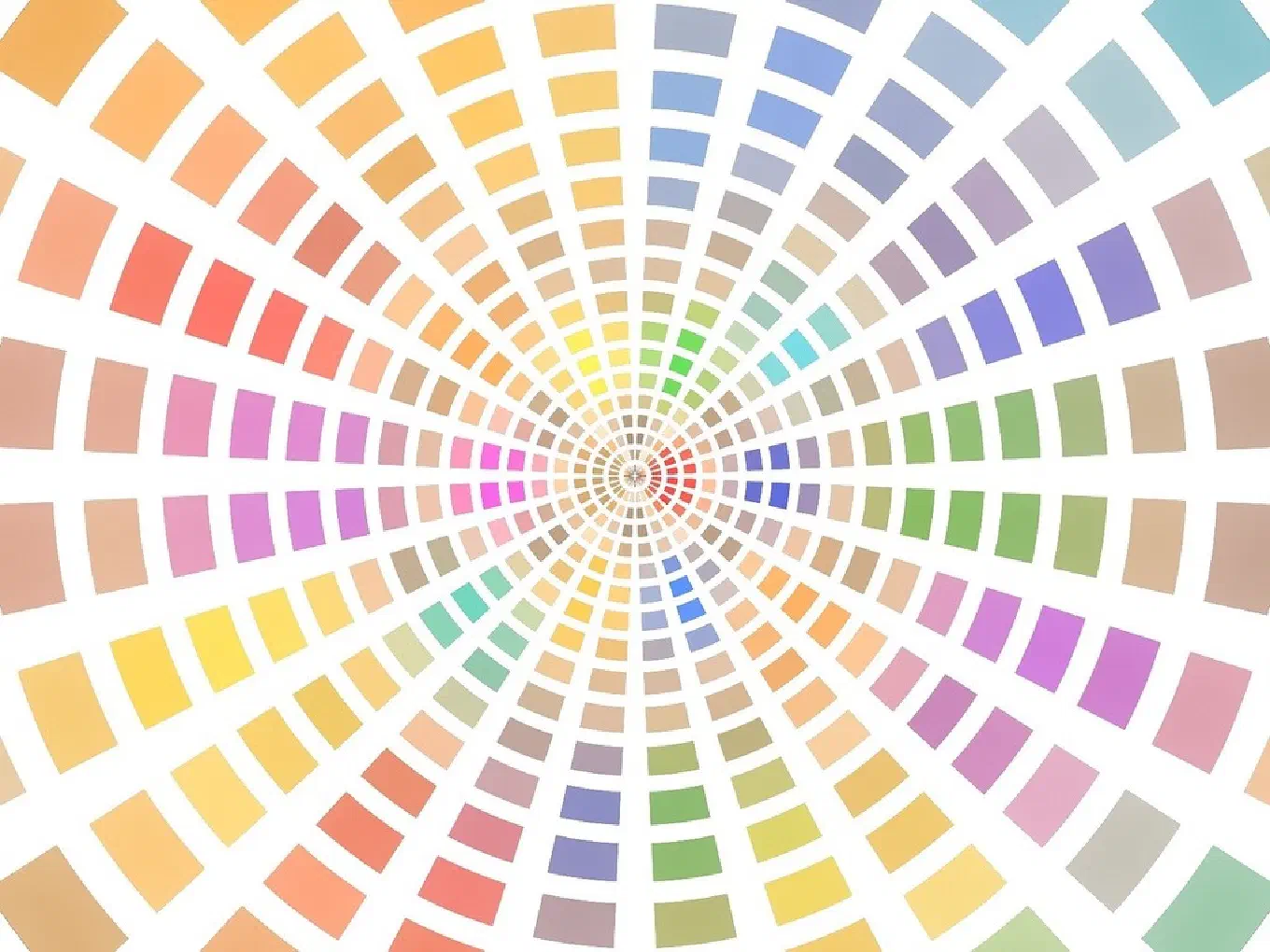
The standard working wheel has twelve hues: three primaries (red, yellow, blue), three secondaries made by mixing adjacent primaries (orange, green, purple), and six tertiaries between them (red-orange, yellow-orange, and so on). Twelve evenly spaced hues is enough resolution to describe every scheme below as a clear geometric shape. Johannes Itten, the foundational color-theory teacher at the Bauhaus, formalized this twelve-color wheel, which he extended into a “color sphere.” The twelve-hue circle is the reference frame for everything that follows.
The two people who explained why harmony works
Two figures are worth naming because their work is the reason the schemes are more than convention.
Michel Eugene Chevreul, a French chemist, formulated the law of simultaneous contrast in the nineteenth century. He defined it as the tendency for a color to appear to shift toward the complementary of its neighbor, in both hue and lightness. Put a gray next to red and the gray takes on a faint green cast. Put orange next to blue and each looks more intense than it does alone. This is the scientific reason a complementary scheme feels vivid: the colors are not just opposite on a diagram, they actively intensify each other in the eye. Chevreul’s law is most noted for its influence on Impressionist and Neo-Impressionist painting, particularly the Pointillist technique of Georges Seurat, who built whole canvases out of tiny juxtaposed complementary dabs.
Johannes Itten is the other. At the Bauhaus he theorized seven types of color contrast: contrast of hue, contrast of value, contrast of temperature, contrast of complements, simultaneous contrast (taken from Chevreul), contrast of saturation, and contrast of extension. One caution worth stating plainly: Itten’s seven contrasts are not the seven schemes in this guide. They are a different taxonomy. Contrasts describe how two colors differ; schemes describe how a set of hues is arranged on the wheel. They are often confused because both lists have seven items, but they answer different questions. Itten’s last one, contrast of extension, is about proportion, how much of the image each color occupies, which is a useful bridge to the idea that a scheme is only half the story. The proportions matter as much as the hues.
Complementary: opposite hues, maximum contrast
A complementary scheme uses two hues directly opposite each other on the wheel: red and green, yellow and purple, blue and orange. Complementary colors, also called opposite colors, produce the strongest contrast of any two-color relationship. When two highly chromatic complements are placed next to each other, the contrast is at its maximum, which is exactly what makes the scheme feel vibrant and energetic.
The geometry is the simplest of all: a single straight line across the center of the wheel, connecting two points 180 degrees apart.
The effect is high energy and high contrast. It is the scheme that makes a focal point pop, a small spot of orange in a blue scene, a red flower against green leaves. The risk is also the strongest. Two saturated complements in equal amounts can vibrate at their shared edge, an unstable optical buzz that tires the eye. The fix is proportion: let one color dominate and use the other as a small accent, rather than splitting the image fifty-fifty.
A concrete use: a portrait against a teal background with warm orange skin tones. The complementary relationship makes the figure separate cleanly from the ground without any hard outline, because the eye reads the temperature opposition as separation.
Analogous: neighboring hues, calm and cohesive
An analogous scheme uses hues that sit next to each other on the wheel, typically three adjacent ones such as yellow, yellow-green, and green. Analogous colors are groups of colors next to each other on the color wheel, and these schemes appear most often in nature: the progression of autumn leaves moving through red, orange, and yellow is an analogous gradient.
The geometry is a tight arc, three or four neighboring slices of the wheel, never spanning more than about ninety degrees.
The effect is calm, cohesive, and low contrast. Because the hues are close together, nothing fights. The image reads as unified, even serene. This is the scheme for mood over drama: a misty landscape in blues and blue-greens, a sunset in reds and oranges and yellows. The risk is the opposite of complementary’s. Without a contrasting accent, an analogous scheme can feel flat or monotonous. Painters fix this by letting one hue lead and by leaning on value and saturation differences to create the contrast the hues themselves do not provide.
Triadic: three hues evenly spaced
A triadic scheme uses three hues spaced evenly around the wheel, 120 degrees apart. On the RYB wheel the cleanest triad is the three primaries: red, yellow, and blue. The secondaries (orange, green, purple) form the other obvious triad.
The geometry is an equilateral triangle inscribed in the wheel.
The effect is balanced and lively at the same time. A triad gives you contrast in three directions rather than one, so the image feels rich and full of color, yet because the three points are symmetrical it stays balanced rather than chaotic. The difficulty is control. Three strong hues competing equally can become noisy fast. The standard solution is the same as for complementary: pick one of the three to dominate and use the other two as support and accent, rather than giving all three equal weight. Much classic illustration and a great deal of children’s design uses the primary triad precisely because it is bold, balanced, and immediately legible.
Split-complementary: contrast without the tension
A split-complementary scheme starts with a base hue, then instead of using its direct complement, uses the two hues on either side of that complement. Blue, for example, pairs not with orange but with red-orange and yellow-orange.
The geometry is a narrow isosceles triangle: one point at the base hue, two points flanking the spot directly opposite it.
The effect is high contrast with less tension than a pure complementary pair. You keep most of the punch, the base hue still sits across the wheel from the two accents, but the accents are slightly off from the exact opposite, which takes the edge off the optical vibration. This makes split-complementary one of the most forgiving schemes to balance, and a good default when complementary feels too aggressive. A use example: a cool blue interior accented with touches of warm red-orange and yellow-orange, which feels warm and inviting without the harsh clash of blue against pure orange.
Tetradic: two complementary pairs
A tetradic scheme, also called the double-complementary or rectangle scheme, uses two complementary pairs at once, four hues that form a rectangle on the wheel. For instance blue and orange together with yellow and purple.
The geometry is a rectangle: two pairs of opposite hues, with the pairs at different distances from each other.
The effect is rich and varied, the most colorful of the schemes so far, because you have two full complementary contrasts working together. That richness is also the danger. Four hues at equal strength have no center of gravity and the image falls apart into competing areas. A tetradic scheme almost always needs one color to clearly dominate while the other three play supporting roles, and it usually works best when you keep one complementary pair warm-leaning and the other cool-leaning so the warm-cool balance gives the eye somewhere to rest. It rewards careful proportion more than any other scheme except square.
Square: four hues evenly spaced
A square scheme uses four hues spaced evenly around the wheel, 90 degrees apart, for example red, yellow-orange, green, and blue-violet.
The geometry is a square inscribed in the wheel, four points each a quarter-turn apart.
The effect is maximal variety. A square scheme covers the wheel more completely than any other, so it offers the widest range of color contrast available. It is also the hardest to balance, harder than tetradic, because the four hues are perfectly symmetrical and none of them has a built-in reason to dominate. Success depends entirely on disciplined proportion and on managing value and saturation so the four hues do not shout over one another. It is a scheme for confident, complex color work, the kind of full-spectrum scene where you genuinely want every region of the wheel represented and you are willing to do the work to keep it from turning into noise.
Monochromatic: one hue, many values
A monochromatic scheme uses a single hue, varied only by changing its value and saturation. The variations are tints (the hue plus white), tones (the hue plus gray), and shades (the hue plus black). One blue, in other words, from the palest sky to the deepest navy, and nothing else.
The geometry is not a shape on the wheel at all. It is a single point, explored inward and outward along the value and saturation axes rather than around the hue circle.
The effect is the most cohesive possible. With only one hue there is nothing to clash, so the image is unified by definition. The catch is that all the visual interest has to come from somewhere other than hue contrast, which means value does the heavy lifting. A monochromatic image lives or dies on its value structure, the same tonal skeleton that holds a grayscale study together. Get the value steps right and a single-hue image can carry as much form and depth as any full-color one. Get them wrong and it collapses into a flat wash. This is the scheme that proves color harmony is often not about color at all.
When an image has no clean harmony
Not every image uses a scheme. This is the most important honest point in any guide to color harmony, and the one most guides skip.
Plenty of strong images, photographs of complex scenes, paintings with deliberately wide or accidental palettes, do not map cleanly onto a complementary line, a triadic triangle, or any of the other shapes. Their colors land on the wheel in a way that does not match a named relationship. That does not make them bad. It means their cohesion comes from something other than hue geometry, often from value structure, from temperature, or from one color dominating by sheer proportion.
The wrong move is to force a label. An honest analysis reports no scheme rather than rounding a messy palette up to the nearest named one. Calling a scattered palette “triadic” because three of its colors happen to fall near an even triangle teaches you nothing and trains your eye to see structure that is not there.
How to recognize a scheme in a real image
Recognizing a scheme means plotting an image’s dominant colors as points on the color wheel and reading the angles between them. Two points roughly opposite is complementary. A tight cluster is analogous. Three points forming an even triangle is triadic, a narrow triangle pointing at one base hue is split-complementary, a rectangle is tetradic, an even square is square, and a single point spread across light and dark is monochromatic.
The hard part is doing this by eye. The brain constantly compensates for color relationships, the same reason a white shirt looks white under both warm lamplight and cool daylight, which makes it genuinely difficult to judge a palette’s true position on the wheel by looking. Proportion makes it harder still, because a scheme is defined by which hues are present, but the feel of an image is driven by how much of each is present, which the eye does not measure well.
Undertone does the recognition for you on any image you give it. Point your phone at a painting, a photograph, a scene in front of you, or import an image, and in under five seconds it extracts the colors, plots them on the color wheel, and reports which of the seven schemes the image uses: complementary, analogous, triadic, split-complementary, tetradic, square, or monochromatic. When the colors do not form a clean relationship, it tells you so rather than forcing one. This maps exactly onto the seven schemes in this guide, which is the natural payoff: the theory becomes something you can see confirmed on real images, instantly, instead of something you have to take on faith.
It also reports the part the schemes leave out. The palette layer shows the dominant colors sized by how much of the image they actually occupy, with painter-friendly names like Cadmium Yellow and Payne’s Gray rather than fantasy ones, which is Itten’s contrast of extension made visible. The temperature map shows the warm-cool balance that decides whether a tetradic or square scheme holds together. The value structure shows the tonal skeleton that a monochromatic scheme depends on entirely. Harmony is the hue geometry, but proportion, temperature, and value are what make the geometry work, and you can see all of them at once.
Everything runs on device. Images never leave your phone, there is no account, and there is no sign-up. The free tier is generous: unlimited analyses with the palette, color harmony, temperature, value, and saturation views, plus a twenty-image history. The color harmony detection this whole guide is about is free. A one-time 9.99 dollar purchase, with no subscription, adds composition guides, the contrast focal map, full-resolution export, and unlimited history.
The same insight runs through every approach to color, whether you are studying the Japanese kasane no irome system of layered silk or Anders Zorn’s four-color palette: harmony is never about a single color. It is about the relationships between colors. The color wheel is a map of those relationships, the seven schemes are its named landmarks, and the most useful skill is learning to recognize which one an image is actually using.
Undertone analyzes any painting or photograph across multiple dimensions: palette, harmony, temperature, value structure, composition, saturation, and contrast. All on-device, one-time purchase, no subscription. Available for iOS and iPadOS, macOS, and Android.