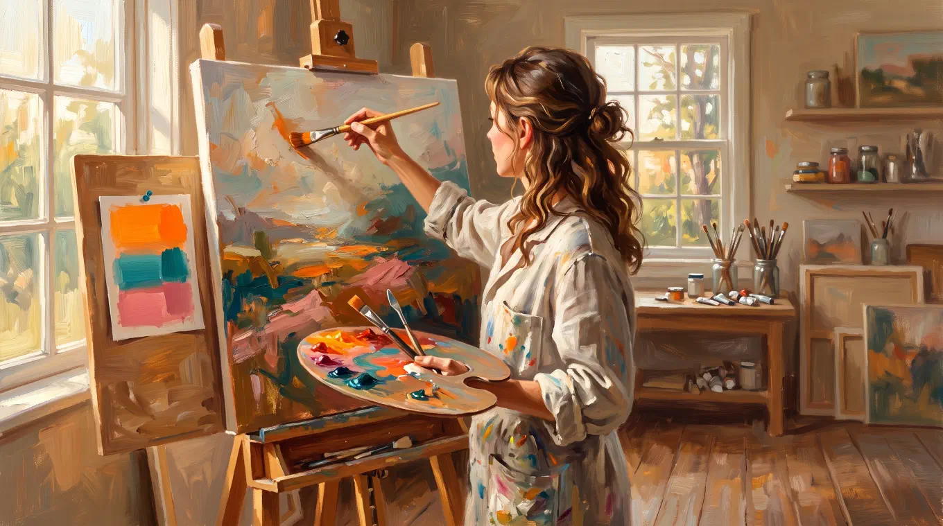
To do a color study, make a small, quick painting that ignores detail and focuses only on color. Simplify your reference to a handful of shapes. Match each shape’s value first, then its hue, then its temperature and saturation. Paint the relationships between colors, not each color alone. The goal is to see color clearly, not to finish a picture.
Contents
- What a color study is, and what it is not
- Color study versus value study
- The order that makes color studies work
- Paint relationships, not colors
- Work small
- How to do a color study from a photo
- How to do a color study from a master painting
- Why matching color from a photo is so hard
- How Undertone makes the seeing instant
What a color study is, and what it is not
A color study is a small, quick painting made to explore color before you commit to a finished work. It is a test, not a product. As the Draw Paint Academy guide to color studies puts it, a color study “focuses almost entirely on color arrangements,” and “the goal of a color study is not to create a beautiful painting but rather to explore and test different arrangements of color.”
That single shift in purpose is what makes the technique work. When the aim is not a finished picture, you stop protecting the surface. You paint fast, flat, and loose, you throw away the ones that fail, and you learn the color of the subject in a way that staring at it never teaches. A color study is where you make your mistakes on purpose, in a place where they cost nothing.
It is also deliberately incomplete. A color study ignores edges, texture, drawing, and detail. Those are real parts of a painting, but they are not what a color study is for, and chasing them is the fastest way to ruin one. If your study looks like a small finished painting, you spent too long on it.
Color study versus value study
A color study and a value study answer two different questions, and understanding the split is the key to using either one. A value study strips color away and reduces the subject to a few tones of gray, so you can see whether the pattern of light and dark holds together. A color study keeps the color and explores the relationships between hues: warm against cool, intense against muted, and how much of each color fills the picture.
The value study asks, does the light and dark structure read from across the room? The color study asks, do these colors work together, and how do I mix them? Value is the skeleton. Color is everything laid over it. This is why most painters do the value study first and the color study second: there is no point solving color on top of a structure that does not stand up.
If you have not planned your tones yet, start there. Our full guide on how to do a value study before you paint covers the two-value notan, tonal grouping, and the way the old masters planned light. A color study is the next layer of that same habit of seeing before painting.
The order that makes color studies work
Match color in a fixed order: value first, then hue, then temperature, then saturation. Judging all four at once is what makes color feel impossible. Taken one at a time, in order, each judgment is manageable.
Value first. Before you name a color, decide how light or dark it is. A color placed at the wrong value cannot be rescued by getting the hue right, because value carries the structure. Squint at your reference until the detail blurs and only the tones remain, and set each shape’s value before you worry about anything else.
Hue second. With the value fixed, ask what the color actually is. Not “green,” but which green: yellow-green, blue-green, a green so grayed it is barely green at all. Name it against its neighbors, not from memory.
Temperature third. Ask whether each color is warmer or cooler than the one beside it. Temperature is almost always relative, not absolute, and it is the quality that turns flat color into light on a form. The Draw Paint Academy guide demonstrates the classic default of “warm lights and cool shadows” under direct sun, though the honest rule is that shadow temperature depends on whatever light reaches the shadow. Our guide to color temperature for painters covers where that rule holds and where it breaks.
Saturation last. Finally, judge intensity. Real light rarely delivers pure, saturated color everywhere. Overcast light mutes everything toward gray, while a low sun can push oranges to their most vivid. Adjust saturation to the light in the scene, not to the color straight from the tube. When intense color and muted color are misjudged against each other, a painting goes either garish or dead.
Paint relationships, not colors
The single most important principle in a color study is that you paint the relationships between colors, not each color on its own. No color has a fixed appearance. A gray looks warm next to a blue and cool next to an orange. A muted red looks vivid beside a neutral and dull beside a pure red. The eye reads every color in the company of its neighbors, so a color study that gets each patch “correct” in isolation can still be completely wrong as a whole.
This is why a color study is worth more than a set of eyedropped hex values. A palette of exact colors tells you what the colors are. It does not tell you how they behave together, which is the information that actually makes a painting read. The landscape painter Mitchell Albala frames the study as the place to find “which pigments and color mixes will translate the color of the light in that particular subject,” and notes that “a series of color studies can liberate you from the single and often limited option proposed by the photograph’s color.” You are not copying color. You are learning how it works, and building a vocabulary you can use on the next painting.
Work small
Keep a color study small, usually a few inches on the long side. Mitchell Albala works his exploratory studies at “perhaps 4 or 5 inches,” with some as small as “4 x 3.5 inches.” That is not a shortcut or a compromise. Small size is the mechanism that makes the study do its job.
A small study forces simplification, because there is no room for detail even if you were tempted. It keeps you loose, because a few inches of surface is not precious. And it is fast, so you can paint three or four different color solutions to the same subject in the time a single careful painting would take. Speed is what turns a study into a real test: you are comparing options, not defending one. Use a large brush relative to the surface, as the Draw Paint Academy guide advises, precisely because “it makes simplification much easier.”
How to do a color study from a photo
To make a color study from a reference photo, follow the order and keep it small and fast.
-
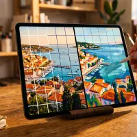
Simplify the reference. Reduce the scene to a handful of large color shapes. Ask the three questions the Draw Paint Academy guide recommends: what is the darkest color, what is the lightest, and what is the strongest or most intense. Those three anchor the whole study.
-
Block in the value structure. Lay down each big shape at its correct value first, flat, with no blending. Squint at the photo to check that your light and dark pattern matches before you touch hue.
-
Set the hues against each other. Now mix the actual colors, judging each one against the shape beside it rather than against your idea of what it “should” be.
-
Push temperature and saturation. Decide where the warm and cool live, and mute or intensify each area to match the light in the scene. This is the step that separates a lifeless copy from a study that captures the feeling of the light.
-
Stop early. When the color relationships read, you are done. Detail is not the goal. A study you overwork stops teaching you.
The hard part of this process is not the painting. It is step two and step four, the seeing. Judging value, temperature, and saturation from a photo by eye is where most studies go wrong, for a reason worth understanding.
How to do a color study from a master painting
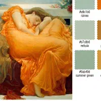
To learn color from a master, copy one. Analyze how a painting you admire is built, then reconstruct its color relationships in a small study of your own. Copying masters is not a beginner’s crutch, it is one of the oldest ways painters have trained. Edgar Degas registered as a copyist in the Louvre and stayed “an enthusiastic copyist well into middle age,” long after he had mastered his own style. The point of a master copy is not to forge the picture. It is to get inside its color logic: which harmony holds it together, where the warm and cool fall, how saturated the color really is, and how much of the surface each color occupies.
A master copy sharpens exactly the judgments a color study depends on. When you try to match the muted, silvery light of a Johannes Vermeer, you discover how little pure color he used and how carefully he controlled temperature. Vermeer’s Girl with a Pearl Earring, painted around 1665 and held at the Mauritshuis in The Hague, looks luminous precisely because so much of it is restrained. You cannot see that by admiring it. You see it by taking its color apart. Undertone ships with that painting as a sample image for exactly this reason, so you can analyze a master’s color the first time you open the app.
Why matching color from a photo is so hard
Matching color by eye is hard because your visual system is actively hiding the information you need. The brain holds an object’s color steady even as the light on it changes, so a white wall reads as white under warm lamplight and cool daylight alike. This is color constancy, described as “a feature of the human color perception system which ensures that the perceived color of objects remains relatively constant under varying illumination conditions.” It is useful for surviving the world and ruinous for painting it, because the temperature and value shifts you are trying to study are the exact shifts your brain is correcting away.
Painters have workarounds. Squinting collapses detail so you compare large masses of value and temperature instead of judging any color alone. Isolating a color through a small hole punched in a gray card removes the surroundings the brain uses to “correct,” so you see the patch closer to what it really is. Both help. Both are still a fight against your own perception, and the harder the color call, the harder your brain works against you. This is the point where measuring the reference beats guessing at it.
How Undertone makes the seeing instant
Undertone does the seeing part of a color study for you. Point it at a reference photo or a master painting and it measures the color structure directly, so the judgments you would otherwise squint and guess at become something you can simply read before you mix a single color.
It gives you the four things a color study is built on. The palette shows the dominant colors sized by how much of the image each one actually occupies, so a reference that is mostly warm neutral with a small cool accent looks like what it is, and each swatch is named against a real pigment library, Cadmium Yellow, Payne’s Gray, not invented marketing names. The color harmony view plots those colors on the wheel and tells you the relationship holding them together, complementary, analogous, triadic, split-complementary, monochromatic, or honestly none, which is the color scheme vocabulary that turns “it works” into “it works because.” The temperature map runs a per-pixel warm-cool analysis so you can see where the warm and cool actually fall, which is the difference between luminous shadows and muddy ones. The value structure posterizes the image into flat tonal zones, from a two-value split up to a finer breakdown, so the light and dark architecture is unmistakable. A saturation view maps how intense the color really is across the image.
All the analysis runs on device, with no account and no upload. The image never leaves it. The palette, harmony, temperature, value structure, and saturation views are free. Composition guides, focal-point contrast, tinted value bands, unlimited history, and full-resolution export are a one-time purchase, not a subscription.
None of this replaces the study itself. You still mix the paint, and mixing is where the learning lives. What it replaces is the guessing at the front of the process. Instead of guess-then-correct, a color study becomes see-then-mix. The same shift that value studies bring to tone, and that a restricted set like the Zorn palette brings to mixing, Undertone brings to color: you understand the structure before you commit, so the painting starts from clarity instead of hope.
Undertone analyzes any photo or painting across palette, color harmony, temperature, value structure, saturation, composition, and contrast. On device, no account, one-time purchase with no subscription. Available for iOS and iPadOS, macOS, and Android.