The best color palette app for a painter in 2026 is Undertone, and the reason has nothing to do with Adobe Color or Coolors being bad. They are excellent. They are just built for someone else. Adobe Color and Coolors extract flat hex palettes for people designing screens. A painter mixing physical paint needs proportions, pigment names, a temperature map, and a value structure, and that is what Undertone is built to show.
If you searched for a color palette app, you are probably one tap from downloading something. This is a fair comparison to help you download the right thing. We fetched each tool’s live pages in July 2026 and confirmed pricing and features before writing.
The short version
- Adobe Color is a free, genuinely great web tool for extracting a 5-color palette and building harmonies on a color wheel. Best for designers inside Creative Cloud.
- Coolors is the fastest palette generator on the web, free with ads, 3 dollars a month for Pro. Best for designers who want to riff through hundreds of palettes quickly.
- Undertone is a color analysis app built for people who mix paint, grade photos, and design with color as a material. It answers the painter’s question the other two do not: not “which five colors,” but “why does this work and why is mine muddy.”
The rest of this piece explains why a painter’s job makes that difference matter.
What Adobe Color does well
Adobe Color, at color.adobe.com, is one of the best free color tools on the web, and it deserves the reputation. You upload an image and it extracts a 5-color palette. You open the color wheel and it builds harmonies for you: monochromatic, complementary, analogous, triadic, and more, with the geometry drawn live as you drag. It has a contrast checker and a color-blind-safe simulator that shows how a palette reads under Deuteranopia, Protanopia, and Tritanopia. It is free, needing only a free Adobe ID, with no locked features for the color work itself. The one paywall is automatically applying a palette inside Adobe’s design apps, which requires a Creative Cloud plan.
Adobe Color was built for web designers, UI designers, and brand and graphic designers working inside Creative Cloud. For that person it is close to perfect. The output is hex and RGB, in five equal swatches, ready to drop into a design file. That is the right output for a screen.
What Coolors does well
Coolors, at coolors.co, is the fastest palette generator most designers have ever used. You press the spacebar and it randomizes a fresh palette. You lock the colors you like and keep spinning the rest. You can extract a palette from an image, adjust it, and export it. The whole experience is built for speed and flow, and it is genuinely fun to use, which is not a small thing when you are hunting for a direction.
Coolors is free with ads. Coolors Pro is 3 dollars a month. The free tier generates palettes of up to 5 colors, saves up to 10 palettes, and gives you 1 project and 1 collection. Pro raises palettes to 10 colors, removes the ads, unlocks unlimited saved palettes, projects, and collections, and adds a contrast checker, color blindness checks, and advanced export formats for web, UI, print, and motion. Like Adobe Color, it is hex-first and aimed squarely at digital designers. For that person, it is a joy.
Why a painter’s job is different
Here is the thing both tools cannot know: a painter is not choosing colors for a screen. A painter is mixing physical pigment, and the questions that decide whether a painting works are not the questions a hex palette answers.
A screen color is final. You pick it, it displays, done. A mixed color is a chemistry problem. Two pigments that both read as “blue” mix into completely different greens, because each pigment leans warm or cool. A shadow that looks muddy is almost never the wrong hue. It is warm paint sitting where cool should be. A painting that reads clearly from across the room does so because its value structure is strong, not because its colors are pretty. None of that lives in a hex code.
So when a painter points a color tool at a reference, the useful questions are: how much of each color is actually there, is this a real color harmony or just a pile of colors, where do the warm and cool fall, and how are the lights and darks organized. A flat five-swatch palette answers the first question partially and the rest not at all.
Where Undertone fits
Undertone was built by someone who actually mixes paint, and it is designed around the painter’s questions rather than the designer’s. It is a color analysis app, not a palette generator. Point it at any reference, photograph, or your own work in progress, and it shows the structure underneath. Five differences matter most.
Palette sized by proportion, not five equal swatches
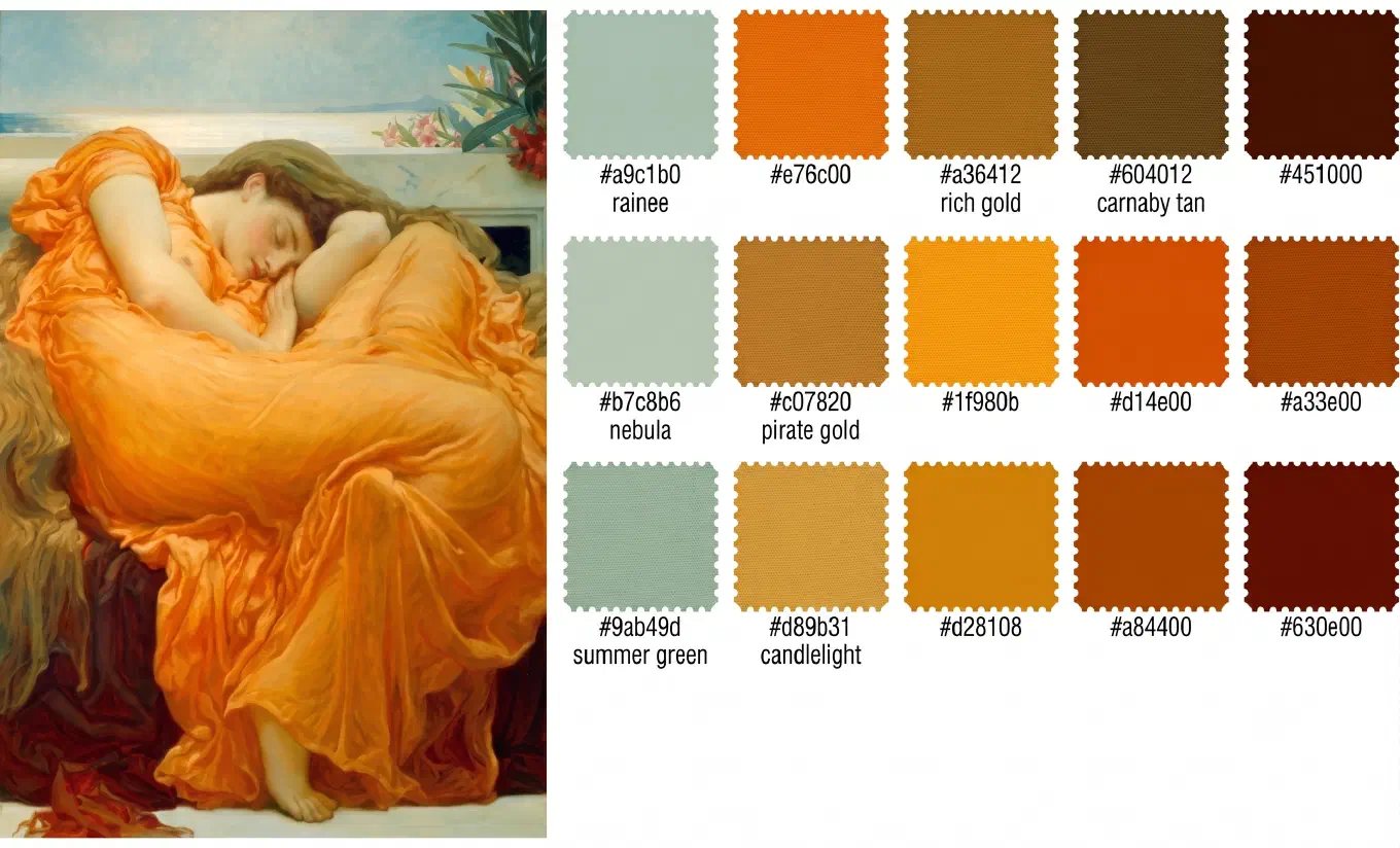
Adobe Color and Coolors hand you colors in equal rectangles. Undertone sizes each color by how much of the image it actually occupies. This is not a cosmetic difference. A palette where warm ochre fills 60 percent of the image and a cool blue accent fills 5 percent is a fundamentally different palette from a 50/50 split of the same two colors. The proportion is often the entire reason a reference works, and it is the information most palette tools throw away. Undertone lists the dominant colors in order of weight, drawn to the size they hold in the image.
Painter-friendly pigment names
Undertone labels each swatch with a real pigment name alongside the hex value: Cadmium Yellow, Burnt Sienna, Payne’s Gray. Not “Autumn Sunset Dream.” This connects the abstract color back to the actual tube on your palette, which is the whole point when you are about to mix it. A hex code tells you nothing about which paint to reach for. A pigment name tells you exactly.
Color harmony plotted honestly
Undertone plots your colors on the wheel and identifies the harmony: complementary, analogous, triadic, split-complementary, tetradic, square, or monochromatic. And when there is no clean harmony, it says so, rather than forcing a label onto a random spread of colors. That honesty matters. The moment you see that a photograph you love is a split-complementary harmony anchored in blue-violet, you own a piece of vocabulary that changes how you work. Adobe Color builds harmonies for you to pick from. Undertone reads the harmony already present in a real image.
A temperature map
This is the feature neither competitor has, and for painters it is often the whole reason to reach for Undertone. It overlays a warm-cool map on your image, showing exactly where the warm lives and where the cool lives. Why do your shadows look muddy? Warm paint leaking into your cools, and now you can see it. Why does golden hour feel magical? Warm light forcing cool shadows by contrast. Why does a game level feel flat? Uniform temperature edge to edge. Temperature is the thing your eye feels but cannot isolate, because your brain is built to correct it away. The map isolates it for you.
A value structure view
Value is how light or dark a color is, independent of hue, and it does more work than color itself. Every art student learns to squint at a subject to blur the detail and see only the pattern of lights and darks. Undertone does the squint for you: it strips the image to grayscale and divides it into discrete tonal zones, light, mid-tone, and dark. Not a continuous gradient, but zones, because zones are how painters actually think about structure. A palette with beautiful color and weak values is mud. This view shows you the architecture before you commit paint.
The comparison table
| For a painter’s work | Adobe Color | Coolors | Undertone |
|---|---|---|---|
| Palette from an image | Yes, 5 equal swatches | Yes, 5 to 10 swatches | Yes, sized by proportion |
| Proportion weighting | No | No | Yes |
| Pigment names | No | No | Yes |
| Color harmony on the wheel | Yes, you build it | Partial | Yes, read from the image |
| Temperature map | No | No | Yes |
| Value structure zones | No | No | Yes |
| Runs fully on-device, no upload | No, web-based | No, web-based | Yes |
| Account required | Yes, free Adobe ID | Optional | No |
| Pricing | Free | Free with ads, Pro 3 dollars/month | Free tier, Premium one-time, no subscription |
| Platforms | Web, plus Adobe Capture on iOS | Web | iPhone, iPad, Mac, Android |
Who each app is best for
Adobe Color is best for web, UI, and brand designers, especially anyone already inside Creative Cloud. If you need a clean five-color palette, a color wheel to build harmonies, and a color-blind-safe check, and your output is a screen, it is free and it is excellent. There is little reason to look elsewhere for that job.
Coolors is best for designers who work by iteration, spinning through dozens of palettes to find a direction fast. The spacebar workflow is unmatched for exploration, and Pro’s export formats fit a digital design pipeline. If speed of generation is your bottleneck, this is the tool.
Undertone is best for painters, and also photographers, interior designers, and game developers, anyone treating color as a physical or diagnostic material rather than a screen value. If your real question is “why does this reference work” or “why does my mix look muddy,” you need proportions, temperature, and value, and that is what Undertone is for. It runs on iPhone, iPad, Mac, and Android, fully on-device with no account and no upload, so your reference images never leave your phone.
The bottom line
Adobe Color and Coolors are not the wrong tools. They are the right tools for a designer building for screens, and they do that job better than most paid software. But a painter’s job is a different job. Mixing paint, diagnosing a muddy shadow, controlling temperature and value: these are not questions a flat hex palette can answer, no matter how well built the palette tool is.
Undertone answers them. It sizes the palette by proportion, names the pigments, maps the temperature, and structures the value, because it was built by someone who mixes paint for people who mix paint. The free tier gives you the Original view, Temperature map, Value structure, and Saturation map, with 20 analyses kept at a time. Premium is a one-time purchase, not a subscription.
Try the free tier of Undertone on iPhone, iPad, and Mac or on Android. Point it at the reference you keep coming back to, and see the structure you have been sensing all along.