Most people learn exactly one rule of composition, the rule of thirds, and then treat it as the rule. It is not. It is one framework among many, and one of the shallowest. Strong images are built on a much richer vocabulary of structures: golden armatures, diagonal systems, balance principles, paths that move the eye. This guide teaches that vocabulary and how to see it.
The one rule everyone knows
The rule of thirds divides the frame into a three by three grid with two horizontal and two vertical lines, then suggests you place important elements along those lines or at the four intersections where they cross. The intersections are often called power points. The idea is to keep the subject off center, because dead center can feel static.
The term was first written down by John Thomas Smith in 1797, in his book Remarks on Rural Scenery. Smith was quoting and expanding on a 1783 passage by Sir Joshua Reynolds about the balance of light and dark in a painting. So the rule of thirds is real, it has a pedigree, and it is genuinely useful as a first lesson. The problem is not the rule. The problem is stopping there.
The rule of thirds is popular for reasons that have nothing to do with how good it is. It is easy to explain in one sentence. It is easy to overlay as a grid on a phone camera or a viewfinder. It gives a beginner a decision to make when faced with the paralysis of an empty frame. Those are real virtues. None of them mean it is the best way to build an image, and most of the time it is not even the most interesting one.
There is a deeper issue too. A lot of images that get praised for the rule of thirds are not actually using it. A subject that sits near the middle is not following the rule of thirds, it is centered, which is a different framework with a different effect. The rule of thirds specifically requires genuine off center placement. Conflating the two is how the rule gets credit for compositions it had nothing to do with.
Composition is a vocabulary, not a rule
Here is the shift that changes everything. Composition is not a single rule you apply. It is a vocabulary of structures, and different subjects want different structures.
Think about it the way you think about sentences. You would never write every sentence with the same grammatical shape. You choose the structure that fits what you are trying to say. Composition works the same way. A wide landscape with a road running to the horizon wants leading lines. A standing figure wants an S-curve. Three people at a table want a triangle. A reflection on still water wants symmetry. Forcing all of these onto a thirds grid is like writing every sentence as a list.
The ten frameworks below are the working vocabulary. They come from different traditions, ancient Greek geometry, eighteenth century aesthetics, twentieth century design theory, and they each answer a different compositional question. None of them is the rule. Together they are most of the language.
The geometric armatures: golden ratio, dynamic symmetry, rabatment
These three frameworks build invisible scaffolding from the proportions of the rectangle itself. They are armatures, geometric skeletons that you align edges and focal points to.
Golden ratio
The golden ratio, written as the Greek letter phi, is an irrational number approximately equal to 1.618. A golden rectangle has sides in that proportion, and it has a special property: cut a square off one end and the remaining rectangle has the same proportions as the original. Repeat this and you get a series of nested squares that spiral inward toward a point.
In composition, the golden ratio works as an armature. Instead of dividing the frame at the one third and two thirds marks, you divide it at roughly 0.382 and 0.618, slightly closer to center than the thirds grid. Aligning the subject to the nested square armature, oriented so the squares spiral toward the focal point, produces a placement that feels settled without being central.
A caution worth stating plainly. The famous golden spiral, the smooth curve drawn through those nested squares, is overused and oversold. When you actually measure how often a subject follows that spiral curve, alignment is no better than chance. The square armature is the part that does real work. The spiral curve is mostly decoration laid on top after the fact.
Dynamic symmetry
Dynamic symmetry is a system formulated by Jay Hambidge, who lived from 1867 to 1924, from his study of Greek vases and the Parthenon. He published it in Dynamic Symmetry: The Greek Vase in 1920 and The Elements of Dynamic Symmetry in 1926. American painters including George Bellows and Maxfield Parrish adopted it.
The armature is built from diagonals. Draw the two diagonals corner to corner across the rectangle. Then, from each remaining corner, drop a line perpendicular to one of those diagonals. These perpendiculars are called reciprocals. The diagonals and reciprocals together form a web of intersections and angled lines across the frame. Placing horizons, edges, and focal points along this web creates compositions with built in movement and tension, because the structure itself is diagonal rather than horizontal and vertical. It is the framework to reach for when a composition feels correct but lifeless and you want internal energy.
Rabatment
Rabatment of the rectangle is the simplest armature and the most overlooked. Every non square rectangle contains two implied squares, each made by striking a square off one of the short sides. The line where that square ends, the rabatment line, is a natural place for a strong vertical edge or a subject boundary to land. The concept is discussed in detail in Charles Bouleau’s book The Painter’s Secret Geometry.
Rabatment explains a lot of compositions that seem to ignore the thirds grid entirely. A tree, a doorway, or a standing figure placed on the rabatment line sits at a structurally meaningful spot that has nothing to do with thirds. Once you know to look for it, you see it constantly in landscape and interior painting.
The balance frameworks: symmetry, center, steelyard
These three frameworks are about visual weight, how mass distributes across the frame and how it balances.
Symmetry
Symmetry is balance by mirroring. A bilaterally symmetric composition has a near center axis, vertical or horizontal, with the two halves echoing each other. Reflections, formal architecture, and many portraits use it. Symmetry projects stability, formality, and calm. Its risk is that perfect symmetry can feel static or clinical, which is why even strongly symmetric images usually break the mirror with a small asymmetric accent.
True symmetry requires the mirror to actually hold across the frame and the axis to sit near center. A generically busy image is not symmetric just because it is cluttered on both sides, and a composition whose axis drifts far off center loses the effect.
Center
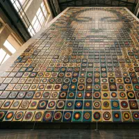
Center weighting places the subject’s visual mass both near the middle of the frame and compact, concentrated rather than spread out. This is the framework the rule of thirds defines itself against, and it is more powerful than the thirds orthodoxy admits. A centered subject commands attention directly. It works for icons, single objects, confrontational portraits, and anything where you want the viewer to look at one thing without wandering.
Center is not the same as a diagonal or a curve that happens to pass through the middle of the frame. Those move the eye across the frame. True center weighting holds the eye in place, because the mass is both central and compact.
Steelyard
The steelyard principle is named after the Roman steelyard balance, a scale where a large counterweight sits close to the pivot and a small weight hangs far out on the arm, and the two balance because leverage trades mass for distance. In composition it means a large mass near the center, acting as the fulcrum, counterbalanced by a small, isolated accent pushed far out toward the edge.
This is asymmetrical balance, and it is one of the most sophisticated tools in the vocabulary. A lone figure on the horizon balancing a heavy foreground mass, a bright small moon balancing a dark landform, these are steelyard compositions. The effect depends on the small element being a genuine counterweight, isolated and far out, not just an off center blob with no balancing role.
The movement frameworks: leading lines, S-curve, triangle
These three frameworks are about motion, how the structure guides the eye through the image over time.
Leading lines
Leading lines are strong edges in the scene that converge toward a point, usually pulling the eye into depth toward the subject or the vanishing point. Roads, rivers, fences, rows of columns, and the edges of buildings in perspective all create them. Leading lines are the workhorse of landscape and architectural composition because they manufacture depth and direct attention along a path.
The framework requires genuine converging lines with real edge support in the image. A single incidental line that happens to point somewhere is not a leading line. The power comes from multiple strong edges agreeing on a direction.
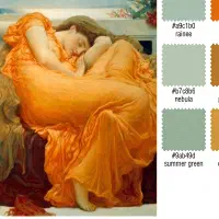
S-curve
The S-curve is a serpentine path that winds through the frame in an S shape, reversing direction at least once at an inflection point. It is one of the oldest ideas in Western aesthetics. William Hogarth called it the line of beauty in his 1753 book The Analysis of Beauty, describing how the S-shaped serpentine line leads the eye a pleasing chase through the composition.
An S-curve moves the eye slowly and gracefully, which is why it suits rivers, paths, reclining figures, and flowing drapery. The defining feature is the reversal: a curve that bends one way and then the other, with a genuine inflection point in the middle. A single arc is not an S-curve. The double bend is the whole point.
Triangle
The triangular arrangement places three distinct, well separated masses at the points of an implied triangle. A triangle with its base at the bottom reads as stable and grounded, which is why it underpins countless group portraits, still lifes, and figure compositions, including much of Renaissance painting. The three points also create a clear visual hierarchy and keep the eye circulating between them.
The structure requires three genuinely separate masses. A single large blob is not a triangle, even if its outline is roughly triangular. The vocabulary distinguishes a triangular arrangement of three things from one thing shaped like a triangle.
How to actually see composition
Knowing the ten frameworks is not the same as seeing them. The names are easy. Recognizing which structure a real image is using, in the moment, takes training. This is the part most composition advice skips, and it is the part that matters.
The traditional method is to squint. Narrowing your eyes blurs detail and collapses the image into a few large shapes, which is exactly the level at which composition lives. Once you see the big shapes, you look for what they form. Do the main masses line up along a diagonal? Does a path snake through with a reversal in it? Do three elements anchor a triangle? Is there a strong edge on a rabatment line? You are pattern matching the blurred shapes against the vocabulary.
The faster you can do this on images you admire, the faster your own compositional instinct develops. You stop composing by rule and start composing by recognition, the same way a fluent reader stops sounding out words. The bottleneck is reps: looking at a lot of strong images and naming the structure each one uses.
Where Undertone fits
Undertone accelerates that training by doing the recognition for you, on any reference you give it. Point it at a photo or a painting and it scores the image against all ten frameworks above, the rule of thirds, golden ratio, symmetry, center, leading lines, triangle, dynamic symmetry, rabatment, S-curve, and steelyard. Each one comes back as a percentage match, and the app ranks them so you see which structure the image leans on most. When nothing clears the confidence threshold, it tells you honestly rather than forcing a framework that is not there.
It does not stop at a score. For each framework, Undertone draws the actual guide lines over the image: the three by three grid with emphasis on the active intersections for the rule of thirds, the nested square armature for the golden ratio, the diagonal and reciprocal web for dynamic symmetry, the converging lines for leading lines, the fitted serpentine path for the S-curve, and so on. You see the structure laid directly over the picture, which is what turns an abstract name into something your eye can recognize next time on its own.
The scoring is built to be honest rather than flattering. A merely centered subject does not score as rule of thirds, because the rule of thirds detection specifically requires genuine off center placement. A busy image does not fake symmetry, because symmetry is measured as real correlation between mirrored halves above what chance would produce. A single blob does not fake a triangle, and an off center blob with no counterweight does not fake the steelyard. The point is to show you the structure that is actually there, not the one you hoped for.
The Original, Temperature, Values, and Saturation modes are free. Composition is part of the premium unlock, along with Contrast, unlimited history, and full resolution export. Premium is a one time purchase, with no subscription. Everything runs on device. There is no cloud, no account, and no AI backend processing your images on a server somewhere. You point the app at a reference, and your phone or Mac does the analysis locally.
The honest throughline
You do not get good at composition by memorizing rules. The rule of thirds will not make your images better, and neither will the golden ratio, or any single framework treated as a formula. What makes images better is an eye trained to recognize structure, so you can choose the framework a given subject actually wants instead of imposing the same grid on everything.
The ten frameworks are the vocabulary. Squinting and naming the structure is the practice. A tool that detects and scores these structures in any reference, and overlays the guide lines so you can see them, is a way to get the reps faster than looking alone would give you. The rule of thirds is where everyone starts. It is a poor place to stop.
Undertone analyzes any painting or photograph across multiple dimensions: palette, harmony, temperature, value structure, composition, saturation, and contrast. All on-device, one time purchase, no subscription. Available for iOS and iPadOS, macOS, and Android.