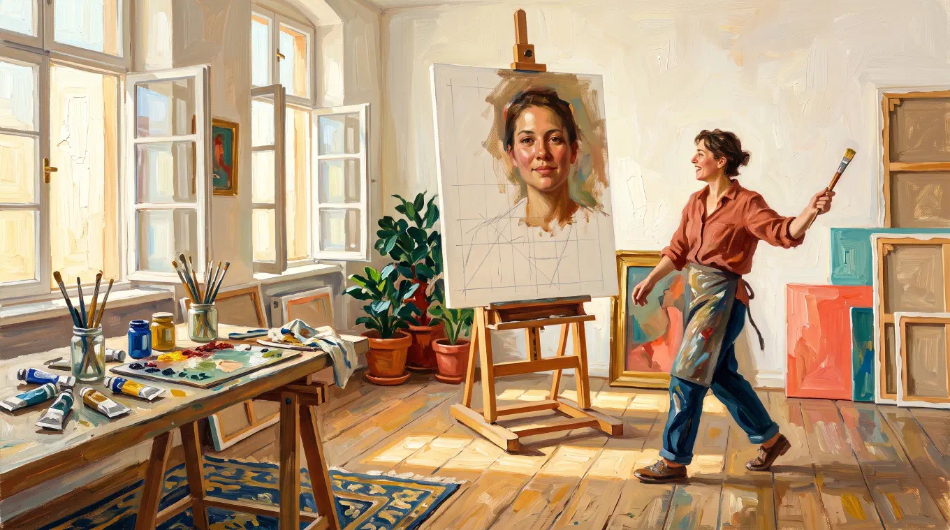
Use a grid on a portrait to measure the gaps between features, not to trace the features. The likeness sits in the spacing: where the eye line falls on the skull, how far apart the inner corners of the eyes are, how far the mouth sits below the nose. Set the grid so its lines land on those landmarks, and the rest of the face follows.
Why a face is the hardest subject to put under a grid
A tree drawn slightly wrong is still that tree. A face drawn slightly wrong is somebody else. That difference is not about skill, and it is not about detail. It is about how human vision handles faces.
The standard account divides configural face processing into three kinds, set out in The many faces of configural processing, a 2002 review by Daphne Maurer, Richard Le Grand and Catherine Mondloch in Trends in Cognitive Sciences. The third kind is sensitivity to what they call second-order relations, which they define as the spacing among the internal features, such as the distance between the eyes. Adults can detect variations in those distances as small as one minute of visual angle, close to the limit of visual acuity.
That is the whole problem in one sentence. You are drawing for a viewer whose measuring instrument, on this one subject, is running at the limit of what the eye can resolve. The same two millimetres of drift that nobody will ever find in a branch will make your sitter’s brother look back at you from the canvas.
The face already stored in your head is wrong, and it wins
The obvious fix is to look harder. It does not work, and this has been measured.
In Systematic Distortions in Vertical Placement of Features in Drawings of Faces and Houses, a 2017 paper in i-Perception, Neil Harrison, Julia Jones and Simon Davies had participants draw faces and measured where the eyes ended up. Drawing from memory, participants put the eyes at a height ratio of .57 against a craniometric average of .477. The higher the number, the further up the head the eyes sit. Then the researchers put the face in front of them. The eyes still landed at .54, against the model’s .48.
Read that again. The model was visible the entire time, and the error survived. The paper notes that the same effect has been reported repeatedly, that errors in vertical eye placement measurably reduce how recognisable the drawn face is, and, honestly, that the reason people do this is still poorly understood. The leading explanation is that a stored internal representation of a face outranks the one actually in view.
So the portrait problem is not a seeing problem. It is an override problem. You are not failing to observe the face. You are observing it and then quietly filing your observation behind something you already believed.
This is what a grid is for on a portrait. Not simplification, and not tracing. It replaces a judgment your brain is documented to get wrong with a reading you take off a line.
Why the upside-down trick is the wrong fix
The famous remedy for the stored face is to turn the reference upside down. Betty Edwards built the exercise into Drawing on the Right Side of the Brain in 1979, on the theory that an inverted image is a task the verbal side of the brain refuses, which lets the visual side take over.
The trouble is what inversion does to exactly the thing a portrait needs. In a 2000 study in Perception, Alejo Freire, Kang Lee and Lawrence Symons asked people to tell apart faces that differed only in feature spacing. Upright, accuracy was 81 percent. Upside down, it collapsed to 55 percent. For faces that differed in the shape of the features instead, inversion cost almost nothing: 91 percent upright, 90 percent inverted. Inversion does not blunt vision in general. It removes the spacing channel specifically, and the spacing channel is the likeness.
When the drawings themselves were finally tested, the result followed. In Physical and perceptual accuracy of upright and inverted face drawings, published in Visual Cognition in 2018, Jennifer Day and Nicolas Davidenko found that upright copies were more accurate than inverted ones on both physical measurement and perceptual judgment, and that the inverted drawings lost spatial accuracy in particular. The sample was small and the authors say so. But the direction is the opposite of the promise, and it is consistent with the earlier work they cite.
The grid does the opposite of inversion. It leaves your face perception running at full strength and hands it a ruler.
Do not choose a grid size. Choose where the lines land.
Every portrait grid tutorial eventually names a number. Ten by ten. One inch squares. Eight divisions across the head. The number is the wrong variable, and it is the reason those tutorials all read the same.
What matters is not how many lines there are. It is where they fall.
Slide the column count up and down and watch the lines move across the face. When a horizontal line runs along the pupils, the single measurement most likely to be wrong stops being a measurement at all. It becomes a fact: the eyes are on the line. Do the same with a vertical against the centre axis of the face. Two of the three hardest judgments in the portrait are now free, and you have spent nothing to get them.
This is a move that only exists with a digital grid. A grid ruled onto a printed photograph is a commitment. Changing it means starting the photograph again, so nobody tries three counts to see which one lands better. On screen the count is a slider, the lines move live, and the right answer is visible in about four seconds.
For a tilted or three-quarter head, resist the urge to rotate the grid to follow the pose. The grid is valuable precisely because it is the one thing in the picture that is not tilted. Keep it square to the image, then read where the centre axis of the face crosses the hairline and where it crosses the chin. The gap between those two crossings, counted in cells, is the tilt. You have turned a feeling into a number.
How fine should a portrait grid be
Use a test, not a count. The grid is right when each square holds one decision.
Too coarse, and a whole eye fits inside a single square. Given a square with an eye in it, you will draw an eye, which means you will draw the eye stored in your head. The grid has done nothing except watch you make the same error. Too fine, and a square holds nothing but a smooth gradient with no edge crossing it, at which point you lose your place and gain no information.
The practical rule that falls out: set the density by the hardest region, the triangle running from the eyes to the nose to the mouth, and let the rest of the picture have more squares than it needs. The hair will be over-gridded. The background will be absurdly over-gridded. This is the correct trade, because the hair costs nothing if it drifts and the mouth costs everything.
Note what this implies. A portrait needs a denser grid than a landscape not because faces contain more detail, but because faces have a smaller error tolerance. Those are different reasons, and only the second one tells you what to do.
Keep the cells square, or your measurements are in two different units
A grid of rectangles quietly rescales vertical distance against horizontal distance. That is survivable on a landscape. It is not survivable on a face, because the measurement most likely to go wrong, the height of the eyes on the skull, runs along the axis being rescaled.
Once the cells are square, a comparison like “the inner corners of the eyes are one and a half cells apart, and the base of the nose sits one and a half cells below them” is a real statement about the face. With rectangular cells it is two numbers in different currencies, and the relationship you thought you had measured is not there.
The classical proportions are averages. The likeness is the departure.
Leonardo da Vinci wrote the rule down around 1490. In the Royal Collection’s study of the proportions of the head, the catalogue summarises his scheme: the eye is at the mid-point of the head, and the face divides into three equal sections, chin to nose base, nose base to brow, brow to hairline.
Keep this, but keep it in the right job. The canon is a smoke alarm, not a target. It will catch the gross version of the eye-placement error before you have committed paint. It will not give you a likeness, because no actual person is the average, and the specific way this sitter departs from the average is the entire reason their face looks like them and not like a diagram.
So the grid and the canon do different work. The canon says the eyes are roughly halfway. The grid says these eyes are a third of a cell above halfway, on a head that is nine cells tall. Only the second sentence is a portrait.
The order of work
- Crop the reference to your canvas proportions first. A face transferred from a 4:5 photograph onto a 5:7 panel stretches, and a stretched face is a different person no matter how carefully you copy the squares. The full method for this is in the complete guide to the grid method.
- Set the count so the lines land on landmarks, not so the count is a round number.
- Turn on square cells before you measure anything.
- Place the landmarks before any contour. The eye line, the centre axis, the inner corners of both eyes, the base of the nose, the line of the mouth, the width of the jaw. Six or seven marks, each recorded as a crossing against a grid line. This is the drawing. Everything after it is decoration on top of a structure that is already either right or wrong.
- Then the contours, square by square. You are not drawing an eyelid. You are drawing a curve that enters the left edge of the cell a third of the way down and leaves through the bottom edge near the centre. Naming the feature is how the stored version gets back in.
- Before rendering, re-check the gaps only. Not the shapes. Measure eye to eye, eye line to mouth, and the width of the head at the cheekbones, and compare each against the reference in cells. If those three are right, the drawing will read as the sitter even where the shapes are loose. If they are wrong, no amount of rendering will rescue it.
- Values last. The form of a face lives in how light turns across it, and that is easier to plan when the structure underneath is already settled. See how to do a value study before you paint.
Chuck Close built a career on step five, painting nine-foot heads one cell at a time and refusing, cell by cell, to know what he was looking at. It is the most extreme demonstration on record of what this method actually asks of you.
Where Overgrid fits
Overgrid puts an adjustable grid on any reference photo, on a phone, tablet, or computer. For a portrait, four of its controls matter more than the rest.
Rows and columns you can move. The land-on-the-landmarks technique above needs a grid you can change freely, which is the whole difference between a digital grid and a ruled one. Drag the column count, watch the lines cross the face, stop when a horizontal sits on the pupils. Keep squares locks the cells square so your vertical and horizontal readings stay in the same unit. Both are free.
Adaptive color. A face covers an enormous value range in a very small area, from a black pupil to a specular highlight on the nose, often within a couple of centimetres. A single grid colour is guaranteed to vanish into one end of that range. Adaptive color picks the grid line colour per pixel against what sits underneath it, so the line stays readable across the pupil and across the highlight. This is a premium feature. If you are on the free tier, the Contrast toggle in Grid options gets you part of the way by drawing a thin outline in the opposite tone behind every line.
Dots, crosses, and diagonals. A full line grid lies across the face and hides the soft value transitions that carry the form. Grid style set to Dots or Crosses marks the intersections and leaves the face visible between them. Diagonals puts an X in every cell, which gives you the centre of the cell and two extra crossings to measure against, useful when a landmark stubbornly refuses to sit near a line. Numbering labels the cells in spreadsheet style, A1 and B3, so you can look away from a low-contrast midtone passage and find your place again. All three are free.
Canvas size. Enter the real width and height of your panel and the size you want each square to be, in centimetres or inches, and the grid is derived from your actual surface instead of from a guessed count. Premium.
The rest of what a portrait needs is there too: crop presets in portrait orientation, including 4:5, 5:7 and 11:14, rotate and flip, and a value study that reduces the reference to between two and eight tonal levels so you can plan the light before you commit. Value study and temperature are premium.
Overgrid is free to download and use, with three projects and reduced-resolution export. Premium is a one-time purchase and never a subscription. Everything runs on the device, with no account and nothing uploaded, which matters more than usual when the reference photograph is a picture of somebody’s face. It is on iPhone, iPad, and Mac and on Android, and one purchase covers every device on the same store account.
The short version
A portrait fails in the spacing, not in the shapes. Your own visual system will hand you a face with the eyes too high and let you believe you observed it. The grid’s job is not to make the drawing easier. It is to make the three or four measurements that decide the likeness into things you read rather than things you judge. Set the lines where the landmarks are, keep the cells square, place the gaps before the contours, and check the gaps again before you render.