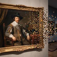
To turn a photo into 8-bit art, cut the colors before you cut the resolution. Rebuild the image on a coarse grid, snap it to a handful of colors, and dither with a regular pattern rather than a soft grain. The color starvation is what makes something read as 8-bit. Everything else is just pixelation.
That ordering is the whole trick, and it comes from what the hardware actually did. So it is worth two minutes on what “8-bit” means before the steps, because the phrase is quietly doing two different jobs.
What “8-bit” actually refers to
The bits are the processor, not the colors. The Nintendo Entertainment System ran an unlicensed variant of the MOS Technology 6502, described as “an 8-bit microprocessor prevalent in contemporary home computers and consoles.” That is where the name came from. The machine was 8-bit the way a car is four-cylinder.
Almost everyone assumes it means 256 colors, because 2 to the 8th power is 256 and the coincidence is irresistible. The hardware says otherwise. The NES “can display up to 25 colors simultaneously out of 54 usable colors,” at a standard display resolution of 256 by 240 pixels, and each sprite tile “can display up to 3 palette colors at a time, with the first entry of each palette representing transparency.”
Twenty-five colors. Three per tile. That is the real constraint, and it is nothing like 256.
The era itself is well defined. The third generation of video game consoles began on July 15, 1983, with the Japanese release of Nintendo’s Famicom and Sega’s SG-1000, and went on to include the Sega Master System and the Atari 7800. There is one more detail worth knowing, because it explains why the label feels like marketing: “it was at the end of the third generation that home consoles were first labeled and marketed by their ‘bits’.” Nobody called the NES 8-bit when it launched. The number became a selling point later, mostly to make the machines that came next sound bigger.
Why 8-bit art looks starved and 16-bit art does not
The generation gap is a color gap, and it is enormous. The NES managed up to 25 colors on screen. The Super Nintendo Entertainment System that followed could display “up to 256 colors, chosen from the 15-bit RGB color space,” out of a palette of 32,768.
That is roughly a tenfold jump in on-screen colors in one hardware generation. It is the entire reason the two eras look different. 8-bit art reads as flat, blocky, and slightly harsh because the artists had almost no shades to work with. 16-bit art reads as shaded and smooth because suddenly they did.
This matters for your photo more than any other decision. If you pixelate an image and leave 32 colors in it, you have not made 8-bit art. You have made 16-bit-era art on an 8-bit grid, and it will read as generic retro. The scarcity is the style.
The word gets used loosely, and that is fine once you know it
Here is the honest part. Almost nobody uses “8-bit” as a hardware spec any more, and the drift is easy to demonstrate. The Game Boy, released in Japan on April 21, 1989, runs an 8-bit Sharp SM83 processor and displays four shades of grey-green. Its look is called 8-bit constantly. But it is a fourth-generation console, not a third-generation one, so by the strict definition it is not part of the 8-bit era at all. It is simply the most recognizable green-and-blocky thing most people have ever seen.
Pixel art does not belong to the consoles either. The term “was first published in a journal letter by Adele Goldberg and Robert Flegal of Xerox Palo Alto Research Center in 1982,” and the practice “goes back at least 11 years before that, for example in Richard Shoup’s SuperPaint system in 1972, also at Xerox PARC.” Pixel art had a name before the Famicom shipped, and it is still going: recent releases in the style include Dave the Diver in 2023 and Balatro in 2024.
So when someone says “make my photo 8-bit,” they usually mean three concrete things: few colors, pixels big enough to count, and a palette that feels like old hardware. That is a perfectly good brief. You just get a better result if you know which of those three is load-bearing, and it is the first one.
One practical consequence. Because “8-bit” is a vibe rather than a spec, it is used by tools that do opposite things: real pixelizers that downscale your actual photo, and AI generators that invent a new picture resembling it. If you want your specific photo rendered faithfully, that distinction decides everything, and we covered it in full in the best photo to pixel art apps.
Step 1: Cut the colors first
Set the color count before you touch the grid, because the color count is what makes the image read as 8-bit rather than merely pixelated. This is the reverse of the usual order, and it is deliberate. Resolution controls how chunky the image is. Color controls which era it belongs to.
A useful range for a single image is 4 to 16 colors. That sits under the NES ceiling of 25 on-screen colors, which is roughly where the eye starts reading “console” instead of “filter.” Start at 8. Watch what breaks. A face usually survives 8 colors if the lighting was clear to begin with, and a landscape often prefers 12. Add colors one at a time and stop the moment the subject holds together, because every color you add past that point is quietly moving you toward a 16-bit look.
In Koadro this is a slider labeled Colors, free from 2 up to 16 and up to 64 with the one-time Premium purchase. Sixteen is already deep in 8-bit territory, so the free ceiling is not the constraint here. The preview redraws live as you drag, so you can find the number by eye instead of guessing.
Step 2: Pick a palette, then decide how it gets applied
Once the count is low, which colors you keep is the difference between “old console” and “muddy photo.” You have two routes, and they behave differently.
An adaptive palette reads the colors out of your own photo and reduces them to the count you set. The result stays true to the original, which is what you want when the photo already has strong, limited color: a red jacket against a grey wall, a sunset, a portrait in warm light.
A fixed palette ignores your photo’s colors and forces the image into a predetermined set. This is where console character comes from. Koadro ships a four-color set drawn from the Color Graphics Adapter, IBM’s early PC graphics standard whose four-color modes give that unmistakable early-1980s look, and the 16-color set from PICO-8, a modern fantasy console built specifically to mimic “the limited audio-visual capabilities of 8-bit systems from the 1980s,” which makes it the closest thing here to a purpose-built 8-bit palette. Both are free. Both land closer to 8-bit than any adaptive result, because a fixed palette is exactly the constraint console artists worked under.
Now the part most guides skip. When you apply a fixed palette, there are two ways to map a photo onto it, and picking the wrong one is why fixed palettes often look broken. Koadro exposes this as a Palette mode control with two options. Faithful snaps each cell to the nearest palette color, so only the palette colors that resemble your photo’s actual colors show up. Feed a warm portrait into a four-color CGA palette in Faithful mode and you may get black, white, and almost nothing else, because none of the cyan or magenta is anywhere near a skin tone. Full remaps the photo’s whole tonal range across the entire palette, sorted by brightness, so every color gets used.
For an 8-bit look, Full is usually the one. Console artists did not get to skip the colors that did not suit their subject. They had four, and they used four. Full puts you in the same position, and that is precisely why the result feels like hardware rather than a filter.
Step 3: Set the grid coarse enough to count
Now the resolution, which is the number of cells the image is rebuilt on. The rule for 8-bit specifically is simpler than for pixel art in general: if a viewer cannot count the pixels without leaning in, the grid is too fine.
The NES ran its entire screen at 256 by 240 pixels, sprites, background, and interface all included. A single character occupied a small fraction of that. So a coarse grid is not a compromise you are making, it is the actual condition the style was born under. For a portrait, somewhere between 48 and 96 cells is usually the zone where the face still reads and the blocks are unmistakable. For a simple object or an icon, go lower.
Koadro’s resolution slider counts cells along the image’s longest side, up to 128 free and 256 with Premium. Note what that means: 256 cells is the NES’s own screen width, so the paid ceiling is already past anything the era ever produced. For 8-bit work the free range is the whole playground. The finer settings exist for people making something else. If you want the general theory of choosing a resolution for any pixel art, not just the 8-bit case, it is covered in how to turn a photo into pixel art.
Step 4: Dither with a pattern, not a grain
Cut a photo to eight colors and its gradients break into hard bands. A cheek that faded gently becomes a step. Dithering is the fix, and for 8-bit the type of dithering matters as much as whether you use it.
Ordered dithering uses a fixed threshold map, usually a Bayer matrix, and it “is characterized by noticeable crosshatch patterns in the result.” That regular crosshatch is the point. It is the look of software drawing on hardware that could not afford anything cleverer, and Microsoft Windows used it in its own 16-color graphics modes. Error diffusion, the Floyd-Steinberg family, scatters its error organically and produces a soft, random grain instead. It is the better algorithm for reproducing a photograph. It is the wrong one for looking like 1986.
So for 8-bit, reach for Ordered. Or, more often than you would expect, reach for nothing at all. Console art frequently used flat blocks of color with no dithering whatsoever, because at three colors per tile there was little to dither with. Flat and ordered are the two authentic choices. Save Floyd-Steinberg for when you want a photo that happens to be pixelated.
Koadro puts all four under a Texture control: Flat for no dithering, Dithering for Floyd-Steinberg error diffusion, Ordered for the Bayer crosshatch, and Noise for a random break-up. Every one of them is free on every tier. Flip between Flat and Ordered on the same image and the difference is immediate.
Step 5: Export without smoothing
Your 8-bit image is now tiny, only as wide as the cell count, so you have to scale it up. Almost every image scaler smooths as it enlarges, blending new in-between colors so photos look natural at larger sizes. That is exactly wrong here. It softens the hard edges you spent four steps creating and turns crisp blocks into mush.
The method you need is nearest-neighbor scaling, which enlarges by repeating each pixel with no blending at all, so every block stays hard-edged at any size. Koadro exports this way by default, with no watermark on any tier, up to 1024 pixels free and 2048 pixels with the one-time Premium purchase. If you are printing, it can also work from a real canvas size and a real pixel size in centimeters or inches, so a physical print lands at true scale.
True 8-bit or just retro pixel: pick one on purpose
These are two different results and most disappointment comes from aiming at one and hitting the other. Decide before you export.
A true 8-bit look means 4 to 16 colors, a fixed palette in Full mode or an aggressively reduced adaptive one, a grid coarse enough to count, and either flat color or ordered dithering. It looks like hardware. It also loses detail, and it should, because that loss is the aesthetic.
A retro pixel look means more colors, often 24 to 64, an adaptive palette that keeps the photo’s real hues, a finer grid, and Floyd-Steinberg dithering to keep skin and skies smooth. It looks like your photo, rendered in visible pixels. It is closer to the 16-bit era, and for a portrait you want to still recognize, it is frequently the better choice.
Neither is wrong. But they are opposites, and a result that sits halfway between them lands on the one thing nobody wants: an image that reads as a phone filter. Commit to one end.
What Koadro does, and one thing it does not
Koadro is a photo pixelizer, which is exactly the tool this method needs. It rebuilds your actual image on a grid you set, in a palette you choose, with honest downscale math and no generative redraw. What comes out is what went in. Everything runs on your device with no account and no cloud upload, and it works on iPhone, iPad, and Mac and on Android, with one purchase covering every device on the same store account.
The controls map straight onto the five steps: a Colors slider, a palette grid with adaptive and fixed sets plus the Faithful and Full palette modes, a resolution slider, a Texture control carrying flat, Floyd-Steinberg, ordered, and noise, and a crisp nearest-neighbor export. The free tier is a genuine tool rather than a trial: full pixelation, crop and rotate, every palette, every texture, up to 128 cells, up to 16 colors, export up to 1024 pixels, and up to ten saved projects, with no ads and no watermark. Koadro Premium is a single one-time purchase, no subscription, that unlocks 256 cells, 64 colors, diamond and hexagon mosaic tiles, real-size printing, 2048 pixel export, custom palettes, unlimited projects, and saved presets. The App Store listing states it plainly: “Pay once. No subscription. No ads. No watermark. Ever.”
Here is the honest gap. Koadro does not ship a Nintendo Entertainment System palette or a Game Boy palette. It ships CGA and PICO-8 on the console side, and its taste-named sets, Noir, Sepia, Matcha, Nord, Dusk, Terracotta, Ukiyo-e, and Riso, on the other. So for a strict 8-bit result you get there by cutting the color count hard, by using CGA for a four-color read, or by building the exact colors by hand with custom palettes, which are part of Premium. A reference palette for the NES is published on Lospec if you want to transcribe one. And if all you want is a named NES or Game Boy palette in a single tap, the free browser tool 8bitphoto.co.uk has them and processes everything locally in your browser. Saying so costs us nothing. You should use the tool that does the job.
The short version
Read the word “8-bit” as a color budget, not a resolution. The Nintendo Entertainment System got 25 colors on screen and 3 per tile, and every visual quality people love about that era follows from the scarcity. So cut the colors first, choose a palette and force the whole thing into use, set a grid you can count, dither flat or ordered, and export sharp. Do that and the result looks like 1986. Open Koadro, drop the Colors slider to 8, and you will see it in about four seconds.