Pixel art matters now, and not for nostalgia. A pixel is the only part of a digital image you can count. The word reached print at NASA in 1965, for pictures arriving from Mars, and the first one was colored in by hand. When any image can be generated, a picture that shows its own construction is worth more, not less.
The word came from Mars
In 1965 someone at NASA’s Jet Propulsion Laboratory needed a word for the smallest piece of a picture. The word “pixel” was first published in 1965 by Frederic C. Billingsley of JPL, “to describe the picture elements of scanned images from space probes to the Moon and Mars.” Billingsley had picked the word up from Keith E. McFarland at the Link Division of General Precision in Palo Alto, who said only that it was in use at the time, around 1963, and that he had no idea where it started. The word arrived sideways, from people who needed it before anyone thought to name it.
That same year, the pictures arrived too. Mariner 4 flew past Mars on July 14, 1965 and returned the first close-up photographs of another planet. They did not arrive as photographs. They arrived as numbers on teletype printouts, one number per picture element, sent home at 8 and a third bits per second from 134 million miles away, roughly six hours per photograph. The machine that turned those numbers back into an image was slower still.
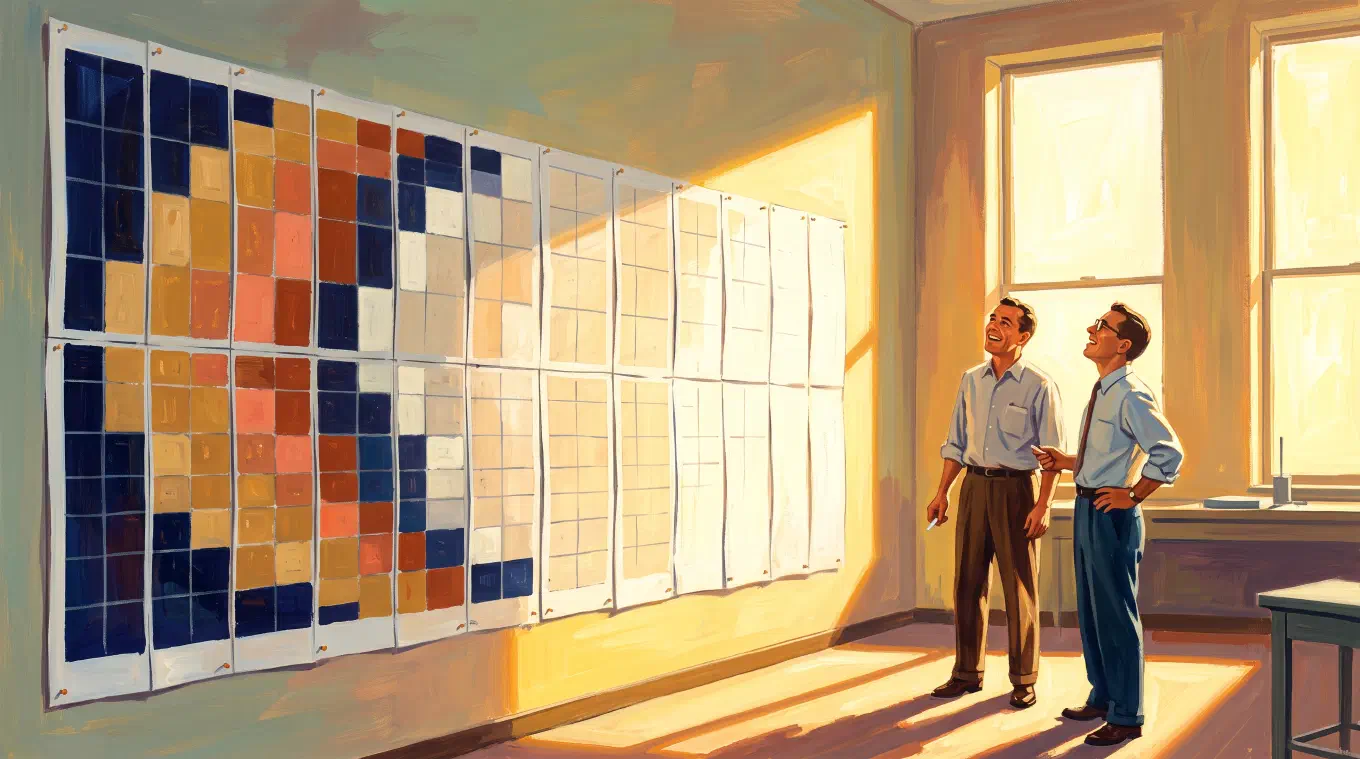
So the team did not wait for it. Engineer Richard Grumm bought a set of pastels from a local art store to shade the ranges of numbers on the printouts. They cut the printouts into strips, stapled the strips to a wall in the correct order, built a color reference chart so the shading stayed consistent, and colored in Mars by hand. When it was finished they cut it off the wall and gave it to JPL Director William Pickering. It hangs outside the visitors’ gallery at JPL’s historic High Bay 1 today.
Sit with what that object is. The first close-up picture humanity ever had of another world is a grid of counted cells, filled in by hand, with a key. It is paint by numbers. It is a cross-stitch chart. And it was not decoration or whimsy. It was the fastest honest way to see what the numbers said.
That is the pixel’s original job, and the job has not changed. A pixel is a unit of evidence. Each one is a measurement of a particular place, and the grid is the record of where each measurement belongs.
Counted grids are thousands of years older than the computer
The digital era did not invent the idea of building a picture out of countable units. It inherited it. A tessera is a single tile in a mosaic, and by the second century BC Roman workshops were cutting marble and limestone into small cubes and arranging them into figures and patterns. Byzantine mosaicists later sandwiched gold leaf between layers of glass to make cells that glowed. Cross-stitch charts, weaving drafts and paint-by-numbers kits all work the same way. So does Chuck Close, who painted nine-foot faces one grid square at a time.
The reason humans keep reaching for the counted grid is that it converts one impossible problem into many small solvable ones. Nobody can paint a nine-foot face. Anyone can paint one square inch of it correctly, several thousand times. The grid is not a shortcut around skill. It is a way of holding a problem that is otherwise too large to hold.
The pixel is simply the newest name for this. What changed in 1965 was not the idea, it was that the cells finally came with numbers attached.
Almost everything since has been an effort to hide the pixel
Here is the part that makes the present moment strange. Once computers could actually draw, the entire direction of the engineering was to make the pixel stop being visible. Anti-aliasing softened the staircase on diagonal edges. Subpixel rendering borrowed the red, green and blue stripes inside each cell to fake positions between cells. And then density did the rest: the Retina display arrived on the iPhone 4 in 2010 at 326 pixels per inch, marketed on Steve Jobs’s claim that roughly 300 pixels per inch is where a screen held 10 to 12 inches from the eye stops showing its own grid.
That is a sixty-year campaign, and it succeeded. Which means a visible pixel in 2026 is not a limitation anyone is stuck with. It is a refusal.
This is genuinely new. In 1982 you saw the pixels because there was no alternative. Today you see them because a person decided you should, and decided how many, and decided which colors. The constraint stopped being imposed and became chosen, and a chosen constraint is an artistic position rather than a technical fact.
Susan Kare and the discipline of 1,024 squares
The clearest demonstration of what a grid does to thinking is the original Macintosh interface. Susan Kare designed those icons on a 32 by 32 pixel grid, working in pencil in a cheap grid notebook she was told to buy at the University Art store in Palo Alto, one square per pixel. The Museum of Modern Art acquired her notebooks of sketches for the original Macintosh user interface in 2015.
Thirty-two by thirty-two is 1,024 squares. That is the entire budget for an idea. It is not enough to render a pair of scissors, and that is exactly the point: at 1,024 squares you cannot depict a thing, you can only mean one. The grid strips away every decision except the one that matters, which is whether the idea is legible at all.
Painters know this instinct under another name. A value study reduces a painting to a handful of tones precisely so the composition has nowhere to hide. The pixel grid does the same thing to an image. It is a machine for finding out whether something holds up once the detail is gone.
CryptoPunks chose 24 by 24 on purpose
Then came the strangest piece of evidence, and it is worth looking at coldly, because the surrounding noise makes people miss it.
In June 2017, Larva Labs released CryptoPunks, 10,000 algorithmically generated characters at 24 by 24 pixels on the Ethereum blockchain. The interesting fact is not what they later sold for. It is the design choice. Two developers set out to demonstrate that a digital object could be singular, countable and owned, and the form they reached for was a 24 by 24 grid. Not a photorealistic render. Not a high-resolution illustration. Five hundred and seventy-six cells, each one inspectable.
That is not an accident of taste. A tiny pixel grid is the most legibly finite thing a screen can display. It looks like what it is claiming to be: a specific, bounded, countable object. Photorealism is bounded too, but it performs the opposite, it performs endlessness.
The money that followed was a bubble, and it burst, and a lot of people lost real savings buying pictures on the theory that the price was the point. None of that market behavior was evidence about the images. Pretending otherwise was the whole mistake.
The pixels outlasted it anyway. In February 2023, the Centre Pompidou acquired 18 NFTs by 13 artists into France’s national collection of modern and contemporary art, CryptoPunk #110 among them, donated by Yuga Labs. In December 2025 the Museum of Modern Art added eight CryptoPunks and eight Chromie Squiggles to its permanent collection, all of them donated rather than purchased, housed in the Media and Performance department. The prices did not survive. The 24 by 24 grid did.
Dither-punk, the style with a resolution ceiling
The most revealing recent case is a game. Lucas Pope’s Return of the Obra Dinn, released in 2018, is a fully three-dimensional game rendered in one-bit black and white, with dithering standing in for every shade of gray. Pope built it to look like the games on the old Macintosh Plus.
The technical detail is the good part. Pope locked the render to a deliberately low resolution, 640 by 360 pixels, because past a certain fidelity the dither pattern becomes invisible and the image simply reads as grayscale. The effect depends on the viewer being able to resolve the individual dots. Game Developer named the resulting movement dither-punk.
Think about how unusual that is. Nearly every visual medium improves with more resolution. This one has a maximum. Go above it and the style does not get sharper, it evaporates. Obra Dinn had to refuse resolution the way a photographer refuses light, as a positive act.
That is the whole argument in miniature. In an era where more fidelity is always available and usually free, some qualities can only be obtained by declining it.
When every image is free, construction is what is worth showing
Which brings us to the present. Image generation is now abundant, fast, and seamless. Anyone can have a beautiful, smooth, plausible picture of nearly anything in seconds.
The consequence is not that images lose value. It is that a particular kind of value moves. When perfection is free, perfection stops being evidence of anything, because it no longer tells you what happened to produce the picture. A flawless image and a fabricated one now look identical, and increasingly they are the same thing.
A pixel grid behaves differently. It shows its own construction. Every cell is a stated decision about one place in the image, and the decisions are enumerable. You can zoom in and check.
This is also the practical reason generated pixel art rarely survives inspection. Diffusion models make images in the style of pixel art by rendering at high resolution and reducing, so the output tends to carry cells that do not sit on a single grid, far more colors than a real palette would hold, and soft edges where a pixel demands a hard one. It is not a moral failure of the tools, it is a consequence of how they work. But it is checkable in about four seconds: zoom in and see whether the pixels form one consistent grid.
Real pixelation is a downscale of an image that already exists. The grid is chosen, the palette is chosen, every cell is derived from measured color in the source, and what comes out is what went in. In that sense a pixel grid is a receipt. It does not ask you to trust it.
That is what the JPL team was doing on the wall in 1965. They were not stylizing Mars. They were making the numbers visible in the only medium that could carry them honestly at the speed they needed, and the result happened to be beautiful.
Where Koadro fits
Koadro does the one thing this essay is about. It takes a photograph you already have and rebuilds it as real pixel art on your device, with honest downscale math. You set the grid, the number of colors, the palette, the dithering and the tile shape. It never generates a new image, so what comes out is your actual photograph, cell for cell.
The one-bit case is there too. The Mono palette is literally two colors, black and white, with a tonal ramp and optional tint, and ordered dithering gives the regular Bayer crosshatch rather than a soft grain. That combination is the dither-punk look, applied to your own photo.
Everything runs locally, with no account and no cloud upload. It is a one-time purchase with no subscription, no ads and no watermark, on iPhone, iPad, Mac and Android.
The short version
The pixel was named to carry evidence home from another planet, and the first time anyone turned that evidence into a picture, they filled in the squares with pastels bought down the road. Everything since has been an effort to make that square disappear, and it worked. So the visible pixel is now a choice, which means it is a statement, and the statement it makes is the one that is scarce right now: here is exactly how this picture was built, count it yourself.