See Why Colors Work. Not Just Which Ones.
Point your phone at anything and get the color structure underneath: palette with proportions, color harmony, temperature map, and value structure. Built for painters, photographers, designers, and anyone who works with color seriously.
For artists who want to understand color, not just pick it.
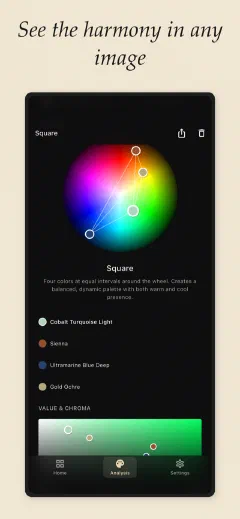
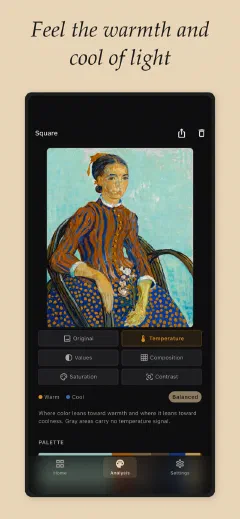
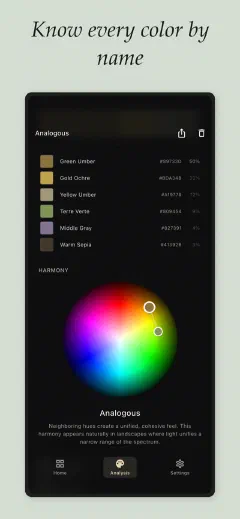
Every image has a color structure. The palette, the harmony, the temperature, the value. The relationships that make an image feel right. Every painter, photographer, and designer senses it. But sensing is not the same as seeing.
Undertone makes the structure visible. One tap, and you see the four things that determine whether color works: what the colors are and how much of each, how they relate to each other, where the warm and cool live, and how the lights and darks are structured. Not poetic descriptions. Not hex codes in a vacuum. The actual architecture of color in any image you care about.
Four Layers of Color Analysis
Palette with Proportions
Most palette tools hand you five flat swatches in equal rectangles and call it done. That is not a palette. A palette where warm ochre occupies 60% of the image and a cool blue accent occupies 5% is a fundamentally different palette from a 50/50 split, even if the exact same two colors are present. Undertone shows you the dominant colors in order of weight, sized by how much of the image they actually occupy. Each swatch labeled with hex values and painter-friendly names. Cadmium Yellow. Payne's Gray. Not "Autumn Sunset Dream."
Color Harmony
Colors that work together follow geometric relationships on the color wheel. Complementary. Analogous. Triadic. Split-complementary. Tetradic. Square. Monochromatic. Or honestly, none -- not every image has a clean harmony, and Undertone will not pretend. Your colors are plotted on a wheel so you can see the geometry. The moment you see that your favorite photograph is a split-complementary harmony anchored in blue-violet, you own a piece of vocabulary that changes how you work. That vocabulary is power.
Temperature Map
This is the feature that makes the invisible visible. A warm-cool overlay on your image showing exactly where the warm lives and where the cool lives. Why do your shadows look muddy? Warm paint leaking into your cools. Why does golden hour feel magical? Warm light forcing cool shadows by contrast. Why does your game level feel flat? Uniform temperature from edge to edge. Toggle the temperature map on, and the thing you could feel but could not diagnose becomes obvious.
Value Structure
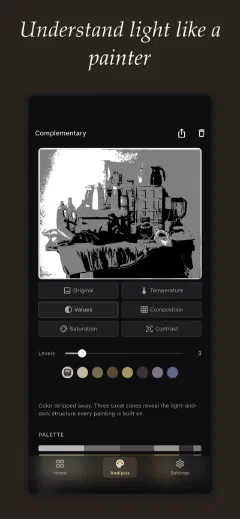
Value is how light or dark a color is, and it does more work than color itself. A painting with strong values and wrong color still reads from across the room. A painting with perfect color and weak values is mud. Every art student learns to squint at their subject to blur the details and see only the pattern of lights and darks. Undertone does the squint for you: your image stripped to grayscale, divided into clear zones -- light, mid-tone, dark. Not a continuous gradient. Zones, because zones are what painters think in.
How It Works
- Point your camera or import any image.
- Full analysis in under five seconds.
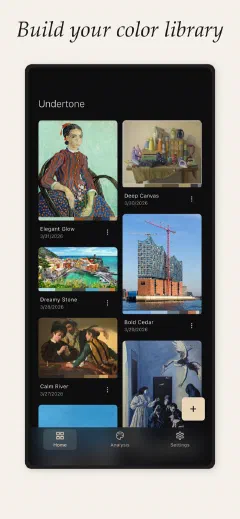
- Every analysis saved. Your phone becomes a color reference library.
Who This Is For
Painters
You mix by trial and error. You waste paint. Your shadows look muddy and you do not know why. The answer is almost always temperature -- warm paint where cool should be, or the reverse. Point Undertone at your reference before you start mixing and you will see the warm-cool structure clearly. Point it at the painting you admire and understand how Sargent used a 5% cool accent against 60% warm neutrals. The gap between seeing color and understanding color is the gap between two years of frustration and one afternoon of clarity.
Photographers
You edit by feel in Lightroom and sometimes you nail it. Golden hour, a cohesive palette, everything sings. Other times the edit feels off and you do not know why. You cannot repeat the good results because you never understood what made them good. Undertone shows you the harmony in your best work so you can apply it deliberately to every shoot. When a client sends a mood board and says "make it feel like this," you can analyze the reference, extract the exact color relationships, and translate a vague request into concrete editing decisions.
Interior Designers
You have a great eye. Your clients do not trust it. When you propose terracotta instead of safe gray, the conversation stalls because "trust me" is not evidence. Undertone gives you the evidence. Analyze the room, show the client the harmony type, the temperature balance, the value structure. Show them that your palette is not a matter of taste -- it is grounded in how color actually works. The tool does not replace your eye. It gives your eye a language that non-designers understand.
Game Developers
You have folders full of screenshots from Hollow Knight, Celeste, and Ghibli films. You eyedrop colors from references and wonder why your own levels feel flat. The problem is almost never the hues you picked. It is the temperature and value structure you did not pick. A dungeon needs different temperature contrast than a forest. Analyze your reference, analyze your own scene, and the gap between them becomes specific and fixable. Not "the mood is wrong." Instead: "the temperature is uniform and the value range is too narrow."
"I've been painting for two years and I still couldn't explain why my teacher's palettes worked. I pointed Undertone at her reference and it just... showed me. Split-complementary, anchored in blue-violet, with a warm accent at maybe 8% of the image. I'd been staring at that relationship for months."
-- Sofia, oil painting student, Buenos Aires
Pricing
Free, with no limit on analyses. The free tier gives you Original view, Temperature map, Value structure, and Saturation map on every image, with a 20-image history. Nothing held back on the modes you have access to.
Premium unlocks the full toolkit with a single purchase:
Your Images Stay on Your Phone
- All analysis is performed on your device. Your images are never sent to any server.
- Analysis history is saved locally. We have no access to your data.
- No account required. No sign-up. No email. Open the app and use it.
- No ads. No tracking pixels. No selling your data. One-time purchase, not a subscription.
Understanding Color
What is color temperature?
What is value structure in art?
How do color harmonies work?
What makes Undertone different from other palette extractors?
Is Undertone free?
Still have a question? Get help →
Stop Guessing. Start Seeing.
Download Undertone and understand the color in everything you look at.