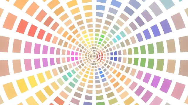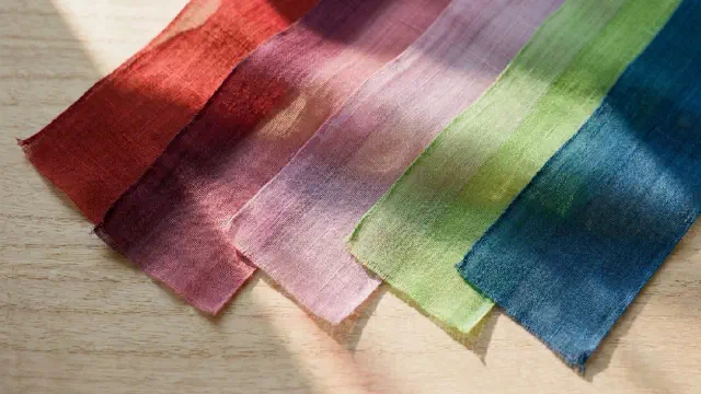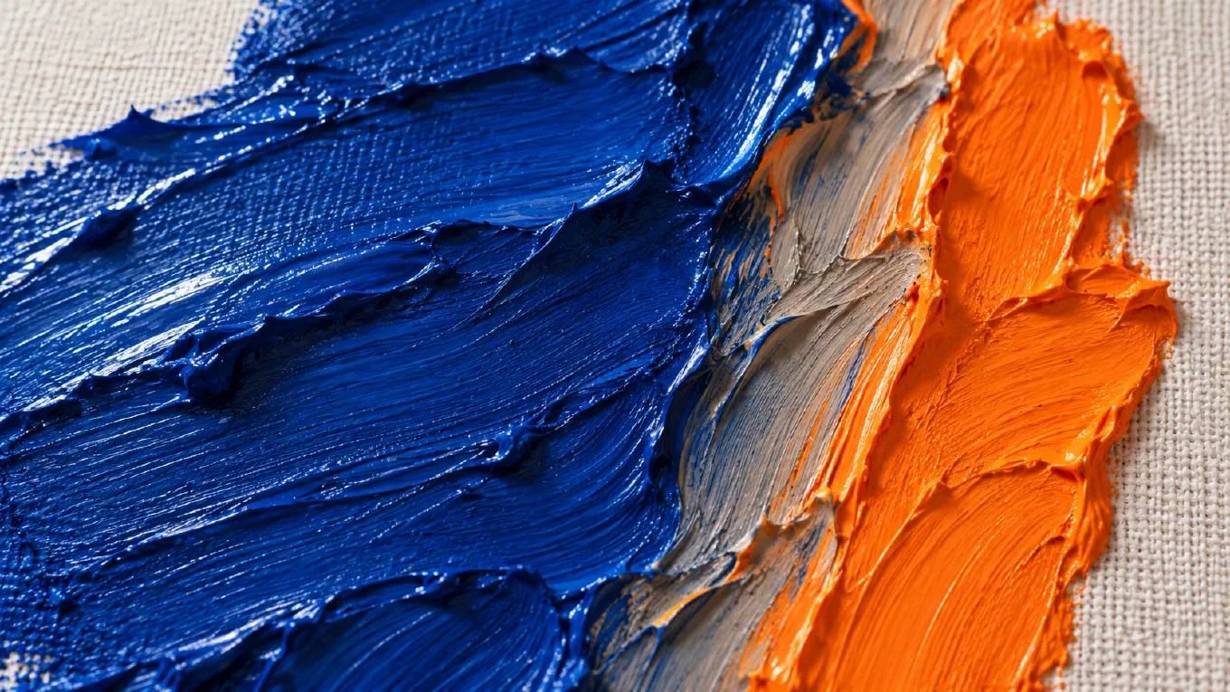
The 12-hue painter’s color wheel has six complementary pairs: red and green, yellow and violet, blue and orange, red-orange and blue-green, yellow-orange and blue-violet, and yellow-green and red-violet. Each pair sits directly across the wheel. A screen uses a different wheel and gives different partners, red and cyan, blue and yellow, which is why two sources can disagree and both be right.
Contents
- Every complementary pair on the 12-hue wheel
- How to find any complement without a wheel
- Why your phone gives a different complement
- Which complement is the true one
- Side by side, complements intensify each other
- Mixed together, complements cancel each other
- The complement of skin color
- Finding the complements in a real image
Every complementary pair on the 12-hue wheel
The standard 12-hue painter’s wheel is built on the RYB color model: three primaries (red, yellow, blue), three secondaries mixed from two primaries each (orange, green, violet), and six tertiaries mixed from a primary and its neighboring secondary. Johannes Itten, who taught color at the Bauhaus, built his color teaching on a twelve-part circle of this kind. Twelve hues opposite each other give exactly six complementary pairs:
| Hue | Complement | Kind of pair |
|---|---|---|
| Red | Green | Primary and secondary |
| Yellow | Violet | Primary and secondary |
| Blue | Orange | Primary and secondary |
| Red-orange | Blue-green | Tertiary and tertiary |
| Yellow-orange | Blue-violet | Tertiary and tertiary |
| Yellow-green | Red-violet | Tertiary and tertiary |
Going around the wheel, the twelve hues run yellow, yellow-orange, orange, red-orange, red, red-violet, violet, blue-violet, blue, blue-green, green, yellow-green. Count six steps from any hue and you land on its complement. Some wheels say purple instead of violet; on a painter’s wheel the two words name the same position.
The table covers every hue, so it also answers the reverse question. The complement of green is red, the complement of violet is yellow, the complement of orange is blue, and so on down both columns.
How to find any complement without a wheel
The complement of a primary is the mix of the other two primaries. Red’s complement is green because green is yellow plus blue. Yellow’s complement is violet, red plus blue. Blue’s complement is orange, red plus yellow. Each complementary pair therefore contains all three primaries between them, which is the whole reason the pair behaves the way it does in paint.
Tertiaries follow the same logic one step further. Red-orange leans toward red and orange, so its opposite leans toward their opposites, green and blue: blue-green. Yellow-green leans toward yellow and green, so its opposite leans toward violet and red: red-violet. If you can name which way a color leans, you can name its complement.
Why your phone gives a different complement
A screen mixes light, not pigment, and its wheel is built on the RGB model: red, green, and blue light. When a tool computes a complement from a hex code by turning the hue 180 degrees, as many do, it is working on that wheel. The screen wheel also has twelve named hues: three primaries (red, green, blue), three secondaries (cyan, magenta, yellow), and six tertiaries (orange, chartreuse, spring green, azure, violet, rose). Its six pairs are different:
| Hue on a screen | Screen complement |
|---|---|
| Red | Cyan |
| Green | Magenta |
| Blue | Yellow |
| Orange | Azure |
| Chartreuse | Violet |
| Spring green | Rose |
The two wheels agree on the general direction and disagree on the exact partner. Compare the names they share:
- Red: green on the painter’s wheel, cyan on a screen.
- Yellow: violet on the painter’s wheel, blue on a screen.
- Blue: orange on the painter’s wheel, yellow on a screen.
- Orange: blue on the painter’s wheel, azure on a screen.
The reason is spacing. On the painter’s wheel, the stretch from red through orange to yellow covers a third of the circle. On the screen wheel, the same stretch covers a sixth. The same name lands at a different angle, so its opposite lands somewhere else.
Which complement is the true one
Both, for different jobs. The screen complement matches what your eye does. Stare at a red square for about 45 seconds, look at a white wall, and the afterimage is cyan, not green. Opponent process theory, set out by the physiologist Ewald Hering, explains it: the visual system codes color as opposed pairs, and tiring the red side makes its opposite appear. Two complementary lights mixed in the right proportions make white or neutral gray, which is the strict definition of a complement.
The painter’s complement is a mixing tool. Red and green paint really do neutralize each other, and the RYB pairs are the ones that generations of painters were taught to reach for. But pigments are messier than light. The color wheel entry puts it plainly: a painter’s wheel is indicative rather than predictive. A cadmium red and a phthalo green cancel differently from an alizarin crimson and a viridian, and the exact neutralizing partner of a given tube is found by testing it on the palette.
A third system, the Munsell color system, arranges ten hues evenly in a circle: red, yellow-red, yellow, green-yellow, green, blue-green, blue, purple-blue, purple, red-purple. Opposite red it puts blue-green, between the painter’s green and the screen’s cyan. The honest summary: red’s complement lives in the blue-green region, and each wheel puts the pin in a slightly different spot.
Side by side, complements intensify each other
Placed next to each other, two complements make each other look more saturated. Michel Eugène Chevreul, the chemist who ran the dye works of the Gobelins tapestry manufactory in Paris, worked this out while investigating complaints about the factory’s dyes, and published it as the law of simultaneous contrast in 1839. The English translation, The Laws of Contrast of Colour, is free on Project Gutenberg. His finding: every color pushes its neighbor toward its own complement. Orange beside blue pushes the blue bluer and the blue pushes the orange more orange.
This is why a small complementary accent carries so much weight. A red poppy in a green field, an orange buoy on a blue sea, a single warm window in a blue dusk. The accent does not need to be large, because the field around it is doing half the work. It is also why two saturated complements in equal amounts tire the eye: each one is pushing the other at full strength along the whole edge they share. Let one dominate and use the other sparingly. The broader logic of choosing pairs, triads, and splits is in our guide to color harmony and the seven color schemes.
Mixed together, complements cancel each other
Mixed together, two complementary paints move toward neutral. Because the pair holds all three primaries, the mixture absorbs most of the light that falls on it, and what comes back is gray, brown, or near black. This is the most useful fact about complements for a painter, and the most dangerous.
Used on purpose, it gives you three tools:
- Muting a color without leaving its family. A touch of green in a red lowers its saturation while keeping it recognizably red. How far to push it is a question of saturation, not hue.
- Chromatic grays. Ultramarine blue and burnt sienna, a blue and a dull orange, are one of the most used gray mixes in watercolor. More blue gives a cool gray, more sienna a warm one, and the gray never goes flat because it is made of two real colors.
- Shadow color. The shadow of an object appears to carry some of its complement; the complementary colors entry gives the shadow of a red apple, which reads as slightly blue-green, and notes painters copy the effect for more luminous shadows. Shadows are also where warm and cool temperature does its work.
Used by accident, the same fact makes mud. Reach for a blue to darken an orange and the two cancel, the shadow goes gray, more paint makes it worse. Our guide to fixing muddy shadows traces that failure step by step, and the Zorn palette shows a palette built to make it nearly impossible.
The complement of skin color
Skin, at almost every tone, is a low-chroma orange: a dull, light or dark version of orange that leans toward yellow in some people and toward red in others. On the painter’s wheel that puts its complement in the blue to blue-green family. Skin that leans yellow-orange points toward blue-violet; skin that leans red-orange points toward blue-green.
In practice this gives two uses. A flesh mixture that has gone too hot or too pink calms down with a very small amount of its complement, a blue or a green, rather than with gray. And a cool, low-chroma passage next to skin, a gray-blue background or a greenish shadow at the jaw, makes the flesh look warmer by contrast, the same simultaneous contrast Chevreul described. The old practice of painting flesh over a green underlayer, verdaccio, used widely in Italian Renaissance fresco and tempera, is the same relationship turned into a method.
On a screen wheel, the numbers agree. A mid skin tone such as #C68642 has a hue of about 31 degrees, and its screen complement sits at about 211 degrees, a mid blue.
The word “undertone” means something specific here, the direction a color leans, and it is exactly what decides which blue or green is the right complement. The full idea is in what an undertone is in color.
Finding the complements in a real image
Knowing the six pairs is easy. Seeing which of them a real painting or photograph is actually using is the hard part, because the eye adjusts every color to its neighbors before you can judge it.
Undertone reads it for you. Bring in any image from the camera or the gallery and it extracts the palette, sizes each color by how much of the image it covers, and names the harmony as the closest fit among the schemes, including Complementary and Split Complementary. A palette counts as complementary when its two dominant hues sit roughly opposite each other. Faint hues are ignored so noise does not invent a scheme, but a small, vivid accent is kept: a terracotta rock against a blue sky is pictorially the complement of the sky, even when it covers a tiny part of the frame. The analysis runs on the device, with no account.
Press and hold any color in the palette and its detail opens: the hex, RGB, and HSL values, and a color labeled Complementary. Be clear about which complement that is. Undertone computes it on the screen wheel, turning the hue 180 degrees, and it also flips the lightness, so a dark color’s complement shows up light and a light color’s shows up dark. A dark brick red gives a light cyan, and a deep navy gives a light straw yellow.
For a painter, that swatch is the light-based answer, the color your eye will push toward when it sits next to the original. Use it as is when you are choosing an accent to set beside a color. When you are about to mix, read its hue family, then take the partner from the painter’s table above. The navy’s straw yellow points to the warm side; on the RYB wheel the mixing partner of a blue is orange, and the tube you test is a burnt sienna or a cadmium orange.
The palette, the harmony, and the Original, Temperature, Values, and Saturation views are free on every image. Premium is a one-time purchase with no subscription. If you are comparing tools before choosing one, our roundup of the best color apps for artists puts Undertone next to the alternatives.
Undertone analyzes any painting or photograph across multiple dimensions: palette, harmony, temperature, value structure, composition, saturation, and contrast. All on-device, one-time purchase, no subscription. Available for iOS and iPadOS, macOS, and Android.