Before photography, every shadow in a drawing or a print had to be built out of marks, and the tool decided which marks. There are six classic ways: chalk hatching, engraving, etching, stipple, mezzotint, and aquatint. Each one makes darkness out of a different physical fact about its tool, and each one teaches something you can use in your own drawing.
That is the idea worth holding onto through this guide. The look of an old print is not a style somebody chose. It is what the copper, the acid, or the chalk allowed. Once you know the one fact that governs each tool, you can read any old master drawing or print, tell the techniques apart at a glance, and borrow the right one for your own work.
- Why the tool decides the tone
- Chalk hatching and Michelangelo
- Engraving and the swelling line of the burin
- Etching and Rembrandt
- Stipple, from Campagnola to the hedcut
- Mezzotint, working from black to light
- Aquatint and Goya
- The differences people search for
- Which technique to borrow for your own drawing
- How to try all six on a photo
Why the tool decides the tone
A pen, a needle, or a stick of chalk can only make a mark or not make one. Gray does not exist for them. So every artist who wanted a shadow had to answer the same question: how do I make an area look darker using only marks? There are only a few honest answers. Put the marks closer together. Make each mark wider. Cross them. Use dots instead of lines. Or turn the problem upside down, start from black, and take marks away.
Hatching is the name for the first answer: closely spaced parallel lines, where the quantity, thickness, and spacing of the lines set how dark the passage reads. Cross-hatching lays a second set at a different angle for the darker values. Every technique in this guide is a variation on that bargain, and the variation comes from the tool. A burin can swell a line and a needle cannot. A rocker can make black and an acid bath can make steps. Learn the tool and you have learned the look.
Chalk hatching and Michelangelo
Chalk hatching is tone built from short strokes of a soft stick, and its governing fact is that chalk is soft and the paper has a tooth. Press lightly and the chalk catches only on the high points of the paper, so a light stroke is broken and airy. Press harder and it fills the valleys. Sharpen the stick and it draws a fine line. Turn it on its side and it lays a broad, soft band.
The great example is Michelangelo’s Studies for the Libyan Sibyl, drawn in red chalk around 1510 to 1511 and now at the Metropolitan Museum of Art. The sheet holds studies from a young male model for the Libyan Sibyl, the enthroned figure on the Sistine Chapel ceiling. The Met’s description notes that Michelangelo sharpened the chalk to a point for the fine contours and some of the interior hatching, and at times worked with the side of the stick. Look at the back and shoulder and you see the hatching laid in short parallel groups, each group set at its own angle as the muscles turn.
What to borrow from it. Let your strokes follow the form. Hatching that wraps around a shoulder describes the shoulder, while hatching laid at one fixed angle across the whole drawing only describes the paper. Work in small groups of strokes rather than in one big field, and let each group find its own angle. And use the softness of the medium: light pressure for the lights, the side of the stick for the broad shadows, the point only where an edge needs it.
Engraving and the swelling line of the burin
Engraving makes tone from the width of a cut line, and its governing fact is the shape of the burin. A burin is a steel tool with a diamond or lozenge shaped point that is pushed through copper, cutting a V shaped groove. Push it deeper and the groove gets wider, and a wider groove holds more ink. As the Victoria and Albert Museum puts it, describing a burin that belonged to Samuel Palmer, the action of engraving “creates a tapered line, which swells in the middle.”
That gives engraving its character. The tool enters the metal and leaves it, so every line starts and ends in a point. The engraver darkens a passage by swelling the line rather than crowding it, so the spacing stays fairly even across the plate. And because the burin is pushed with the whole hand against the resistance of the metal, the lines are long, smooth, and deliberate.
Knight, Death, and the Devil, engraved by Albrecht Dürer in 1513, is the textbook case. Every surface in it, the armor, the horse’s flank, the rock, is built from swelling and tapering lines, with layers of cross-hatching in the deepest shadows. Dürer is the artist most often credited with perfecting cross-hatching in both engraving and woodcut.
What to borrow from it. Vary the weight of a line, not just the spacing. In ink, this means pressing harder or using a flexible nib through the middle of a stroke and lifting at both ends, so each line arrives and leaves. Keep the spacing steady and let the thickness carry the tone. And stop cross-hatching before it closes up: when a third layer is already dark, a fourth turns the area to mud. A single dot placed in each remaining white diamond deepens the tone and keeps it clean.
Etching and Rembrandt
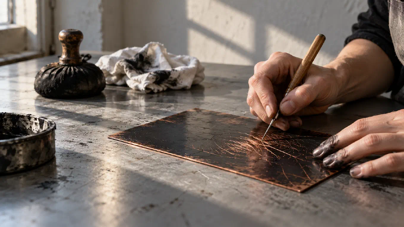
Etching makes tone from spacing, layering, and time in the acid, and its governing fact is that the needle does not cut. The copper plate is coated with a waxy, acid resistant ground. The artist draws through the ground with a needle, which only scrapes the wax away and needs no force at all. Then the plate goes into acid, which bites the exposed lines into the metal. Because pressure buys nothing, the etched line keeps an even width from end to end. To make a line darker, the etcher protects the finished lines with varnish, called stopping out, and puts the plate back into the acid so the rest bite deeper.
The result is the freest line in printmaking. With no resistance from the metal, the hand moves as fast as it does with a pencil, and etched hatching is often loose, quick, and full of small hooks where the hand turned back for the next stroke.
The best place to see it is Rembrandt’s Hundred Guilder Print, from around 1648, in the Rijksmuseum. It is not pure etching. The museum lists it as etching, drypoint, and engraving, and the mix is the point. Drypoint, a needle scratched straight into the copper, throws up a ridge of metal called a burr that holds ink and prints as a soft, velvety dark, richer than the clean etched line beside it. Three tools on one plate, each doing the job it does best.
What to borrow from it. With a pen of fixed width, such as a fineliner, you are an etcher, not an engraver. Your only controls are how close the lines are, how many layers you lay, and how many passes you make, so build darks with several loose passes rather than one heavy one. Leave the lit areas truly empty: an etching gets its light from bare paper. And let the line be fast. A slightly hooked, hurried stroke looks alive in a way a careful one does not.
Stipple, from Campagnola to the hedcut
Stipple makes tone with dots and no lines at all, and its governing fact is that a dot has no direction. More dots, or bigger ones, make a darker area. Fewer, smaller dots make it lighter. Because nothing points anywhere, a stippled tone is the smoothest and quietest a hand can make, and a stippled area never has a hard edge, only a gradual thinning of dots.
The technique goes back to the Italian engraver Giulio Campagnola in the early 1500s. Rather than cutting lines with his burin, Campagnola used it to make thousands of small, soft edged dots, and the Cleveland Museum of Art suggests he was trying to emulate the atmospheric quality of Venetian painting of his day. The method never caught on widely in his lifetime. It came back in the 18th century, first in France as a way to imitate chalk drawings and then in England, where it took the name stipple engraving.
Its most familiar modern form is the hedcut, the small portrait drawing of The Wall Street Journal. The freelance artist Kevin Sprouls introduced the style to the paper in 1979, and it combines stippled dots with small hatched lines. The editors liked that it suited the paper’s classical feel, and it still reads at a glance as an old engraving.
What to borrow from it. Stipple is the technique for skin, fog, and anything soft. Place dots evenly but not in a grid: rows look mechanical and clumps look like dirt. Control tone with both the number and the size of the dots, so the darks do not turn into a solid black and the lights do not look speckled. Never let the dots turn into commas, because a dot with a tail has a direction and stops being stipple. And budget the time honestly. Stipple is slow, which is exactly why it looks calm.
Mezzotint, working from black to light
Mezzotint makes tone by taking ink away, and its governing fact is that the plate starts black. The artist roughens the whole copper plate with a rocker, a curved steel blade with fine teeth, rocking it across the surface in many directions until the plate is covered in tiny pits and burrs. Inked and printed in that state, it prints solid, velvety black. The picture is then scraped and burnished out of the black: smoothed areas hold less ink and print lighter, and fully polished areas print white. Every other technique in this guide adds dark to white. Mezzotint adds light to black.
The first known mezzotint is a 1642 portrait of Amalie Elisabeth, Landgravine of Hesse, by Ludwig von Siegen, who roughened only the areas he wanted dark, working from light to dark with toothed wheels. The fully dark to light method came with the rocker, which is usually credited to Prince Rupert of the Rhine. Rupert’s own mezzotint The Great Executioner dates to 1658, and after 1660 he brought the technique to England, where in the next century it became the favorite way to reproduce portrait paintings. The history of the mezzotint also explains its one weakness: the burr is fragile, so a plate gives only a limited number of really good impressions before it wears smooth.
Its great landscape use is J. M. W. Turner’s Liber Studiorum, 71 plates published between 1807 and 1819. Turner etched the outlines of most plates himself and professional engravers, starting with Charles Turner, worked the tone in mezzotint over it. A few plates Turner also scraped himself, and some combine mezzotint with aquatint. Etched line for the drawing, mezzotint for the light and weather: the division of labor tells you what each technique is for.
What to borrow from it. You can draw this way on paper. Cover a sheet with an even layer of charcoal or graphite, then pull the lights out with a kneaded eraser, working from the darkest masses toward the brightest highlights. It forces you to think in light rather than in outlines, and it is the fastest cure for a drawing where the shadows look timid. Leave the deepest shadows untouched. A mezzotint’s darkest passages are one unbroken mass, and that mass is where the depth comes from.
Aquatint and Goya
Aquatint makes tone in flat, grainy steps, and its governing fact is that acid cannot bite under a grain of rosin. The artist dusts the copper plate with fine powdered rosin and heats it so the grains melt and stick. In the acid bath, the metal under each grain stays untouched and the acid bites the network of channels around them. When the plate is printed, the grains print as tiny pale specks and the channels as ink, so an aquatint tone is a fine speckled texture that reads from a distance like a wash. To make several tones, the artist paints varnish over the areas that are finished and bites the rest again. Each bite drops everything still exposed one step darker. The tone arrives in plateaus, with hard, hand-brushed edges between them.
Francisco Goya used it for Los Caprichos, 80 prints published in 1799, among them plate 43, The Sleep of Reason Produces Monsters, which the Metropolitan Museum lists as etching and aquatint. The National Gallery of Victoria’s study of his process describes how Goya laid his aquatint after the etching and sometimes used different sizes of grain in the same print. In most of the Caprichos, the etched line does the drawing and the aquatint sets the atmosphere: night, dust, dread.
What to borrow from it. Think in a few flat values instead of endless gradients. Most strong pictures read with three or four, and planning them first is what a value study is for. Draw the line first and lay the tone second, as Goya usually did. And let the edges between your tones be decisive. A soft blended edge is a gradient. A brushed, deliberate edge between two flat tones is a design.
The differences people search for
The same few comparisons come up again and again. Each one has a short answer once you know the tool behind it.
Hatching vs cross-hatching. Hatching is one set of parallel lines. Cross-hatching lays more sets at other angles. Hatching handles the light and middle values, and cross-hatching handles the darks, because the crossings pile up more ink than the lines alone.
Stipple vs hatching. Hatching uses lines, which have direction and can describe a form. Stipple uses dots, which have no direction and give the smoothest tone. Hatching is faster and more expressive. Stipple is slower and calmer.
Engraving vs etching. Engraving cuts the line with a burin, so the line swells and tapers and looks deliberate. Etching bites the line with acid after a needle draws it through wax, so the line keeps an even width and looks quick and free. To spot the difference in a print, look at the ends of the lines: pointed ends suggest engraving, blunt ends suggest etching.
Mezzotint vs aquatint. Mezzotint is mechanical and works from black to light, which gives soft, continuous gradations and rich, velvety blacks. Aquatint is chemical and works from light to dark in a few bites, which gives flat, speckled steps of tone. Mezzotint looks like velvet. Aquatint looks like a wash.
Which technique to borrow for your own drawing
The choice follows the subject.
- A face or a portrait: stipple. It is the only one of the six that renders skin without leaving a texture on it.
- A figure, an animal, anything with muscle and volume: chalk hatching. Strokes that follow the form describe the form.
- Armor, metal, architecture, anything crisp: engraving’s swelling line, with even spacing and tapered ends.
- A quick study or an uncertain subject: etching’s loose, even line. It is forgiving because it does not pretend to be precise.
- Night, interiors, a single light in a dark room: mezzotint. Start dark and pull out only the light.
- Strong graphic light and shadow: aquatint. Plan a few flat values, draw the line, then lay the tone.
Then mix them, as the masters did. Rembrandt combined etching, drypoint, and engraving on one plate. Turner put mezzotint over etching. Goya put aquatint under etched line. The techniques are tools, not teams.
How to try all six on a photo
Reading about these techniques only gets you so far. Seeing your own photograph in each one is faster, and that is something Skisa is built for. Skisa draws a photo as a line drawing, on your device, and its Hatching card offers six shading techniques modelled on the traditions in this guide. It simulates their look on your photo. It is not a printmaking process, but each technique is built around the same physical rule as the real one.
Stipple builds tone from dots whose spacing and size both follow the value, placed evenly with no grid. Etching lays strokes of constant width and gets its darks from spacing and layering. Chalk lays its strokes along the form so they model it. Burin gets its tone from the line swelling, with every stroke tapered at both ends. Mezzotint works in reverse: it starts from an inked black and burnishes the lights out of it, leaving the deepest shadows untouched. Aquatint lays its tone in flat plateaus with brushed edges, over the drawn line rather than instead of it.
Stipple, Etching, and Chalk are free. Burin, Mezzotint, and Aquatint come with Skisa Premium, a one-time purchase with no subscription. Below the six tiles, Coverage sets how much of the photo’s tone gets shaded and Thickness sets how heavy the marks are. Pick the instrument and the paper first, then switch between techniques on the same photo and watch the same face turn into a Campagnola, a Rembrandt, or a Goya plate. If you are new to the app, the guide on how to turn a photo into a line drawing covers choosing the photo and the line settings, and how to turn a photo into a coloring page covers the opposite job, lines with no shading at all. If you are still choosing a tool, our comparison of the best photo to sketch apps sets Skisa beside the alternatives honestly.
Skisa is available for iPhone, iPad, and Mac and for Android.
The masters did not choose a look and then find a tool for it. They picked up a tool and learned what it could not do. That is still the fastest way to learn shading: pick one technique, accept its one rule, and see how far the rule takes you.